
Hello, everybody! Are you a fan of Prince? I am one of those who listened to his music in his prime when he was alive and one of my favorites is “Purple Rain“. Many people remember it because of its very long instrumental part. Back in the day when I used to go to stripper clubs I recall incidents when the dancer would get into an argument with the DJ whenever the latter would play this song. This means that she’d be dancing more than she should! Today, I will show you something that reminded me of my wild youth, and just like Prince’s masterpiece the prominent theme will be the color purple.
Introduction:
The Lomography LomoChrome Purple 100-400 is a variable ISO film similar to the Lomography LomoChrome Metropolis 100-400 but it turns things purple as the name suggests. I have heard of this film for a long time and I have always been intrigued by it but I’ve only shot with it recently. I think it has been around for about a decade, it has a strong following online amongst younger film photography enthusiasts because of the unique look it’s able to produce, which somehow resembles cross-processing in such a way that some colors shift their hues to the purple side of the spectrum.
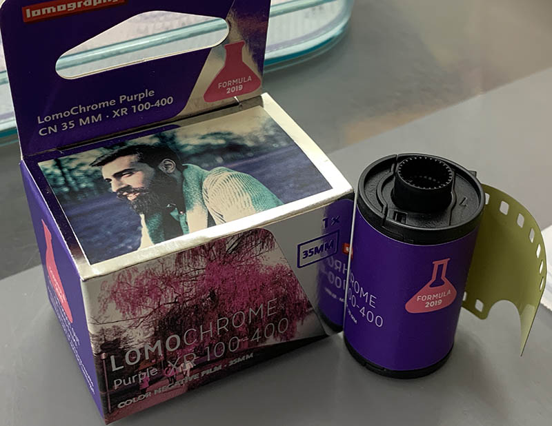
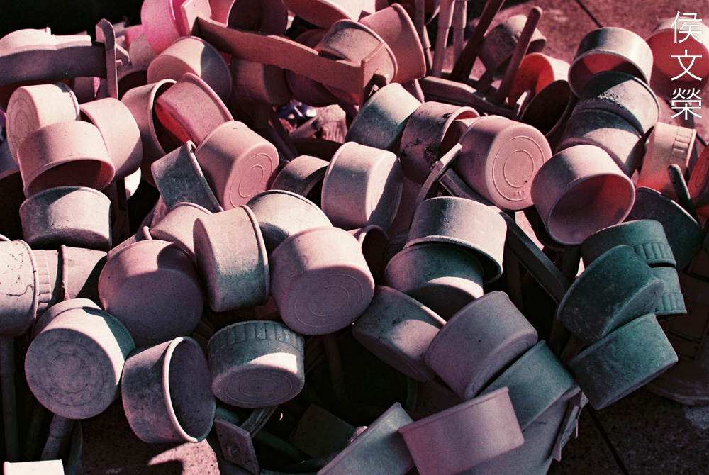
The box looks nice and the film is encased in an equally nice plastic canister. What struck me the most is the color of the base, it’s yellow and kind of thick. It has 36 exposures, I don’t think these are sold in 24-exposure rolls. Be aware that this film doesn’t come with a DX code so you’ll have to dial-in your desired ISO manually or rate it somewhere within the ISO100-400 range for best results according to the box.
There’s not a lot of information about this film’s development around, all I know is that this is a unique formula that was made with shifting colors in-mind. The only way you can achieve a similar result is to shoot with regular film and cross-process it to get some unexpected results. Experimentation is never cheap, it requires a lot of experience and luck. This takes away a lot of the guesswork and you can simply just enjoy the results without all the hassle. It also makes your photos, and yourself more “authentic” since you are basically doing everything straight from your camera and not applying any silly filters to make the pictures look unique.
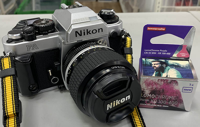
For this article I am shooting with a Nikon FA and the Nikkor 35mm f/1.4 Ai-S. I think this combo is great for this article because we’ll see how it behaves it lowlight situations. The Nikon FA isn’t a cheap camera so it will allow you to set the ISO manually just like a proper camera.
(Click to enlarge)
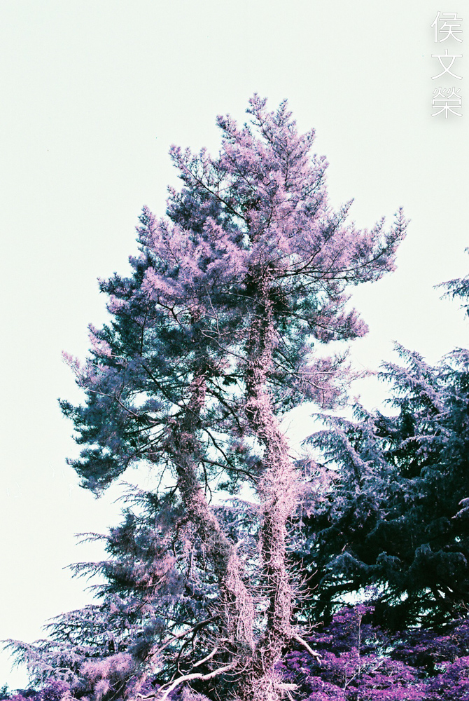
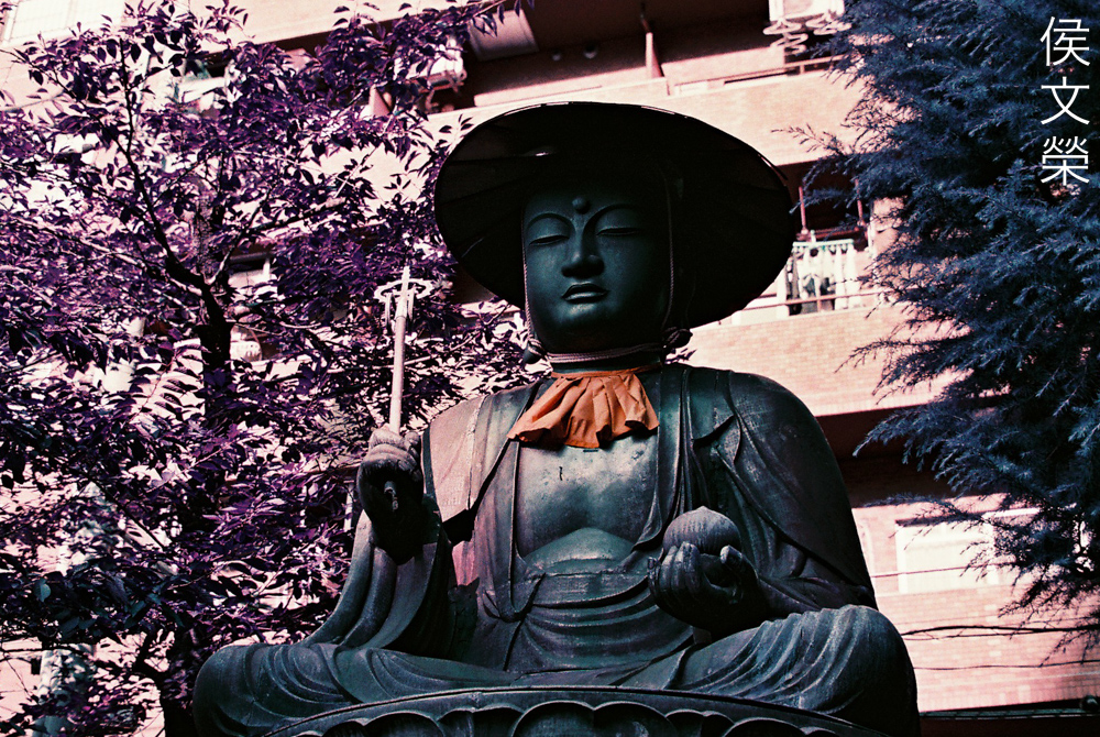
One this I noticed with this film is it has the tendency to render a “hotspot” at the center of the frame. I’ve never seen anything like this apart from the results I get from infrared film or cameras modified to shoot full-spectrum. Is this more sensitive to infrared? I don’t think so since the official documentation says that it’s just a regular film. It’s a good thing that I chose the Nikkor 35mm f/1.4 Ai-S because it’s known to exhibit this trait when shooting infrared film or with a camera that has an infrared filter installed. This is a curious thing indeed. If you’re bothered by this just avoid shooting with the sun directly illuminating your lens’ front or from the side.
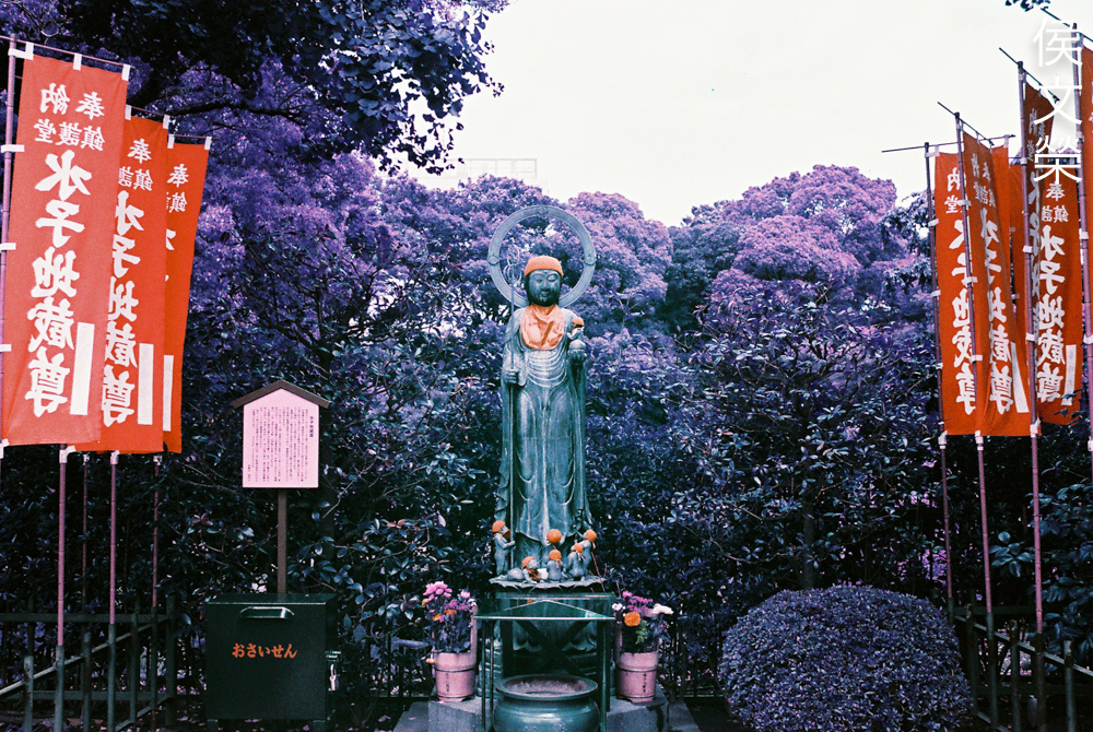
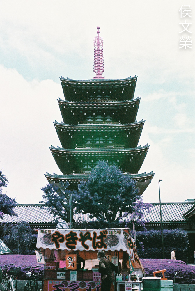
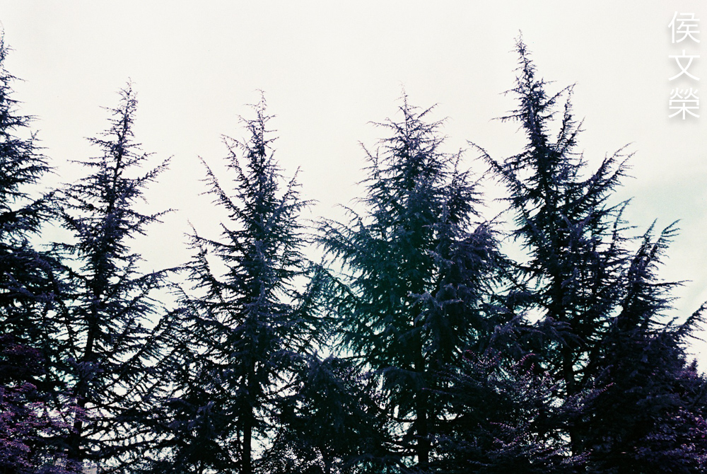
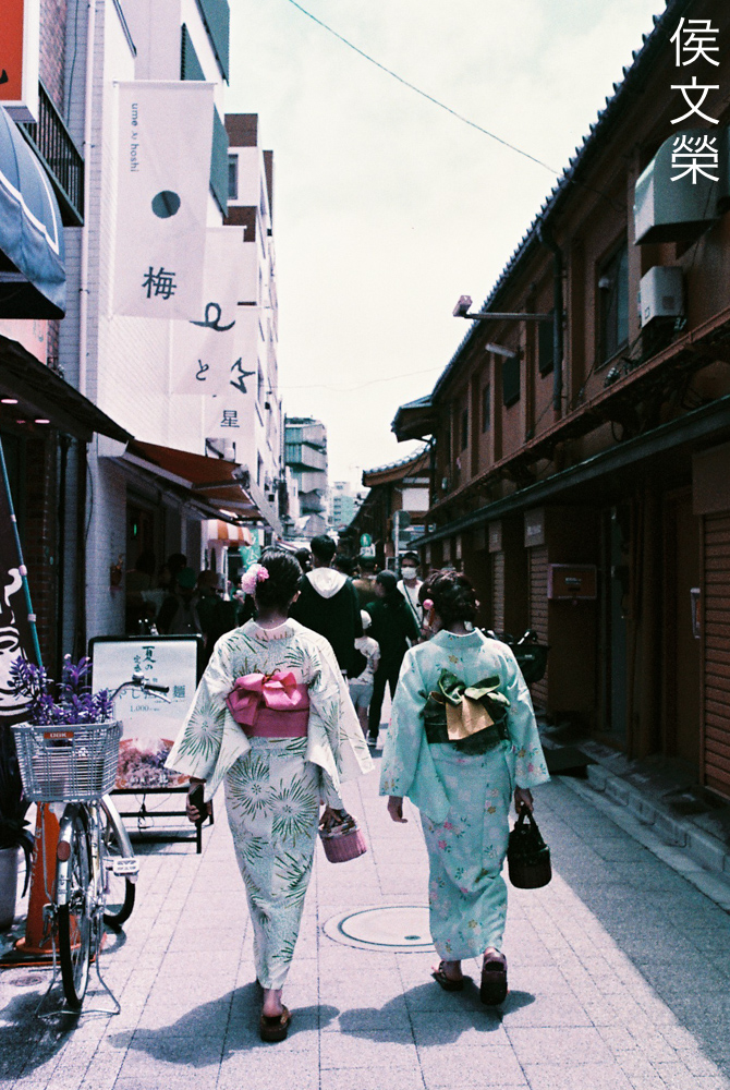
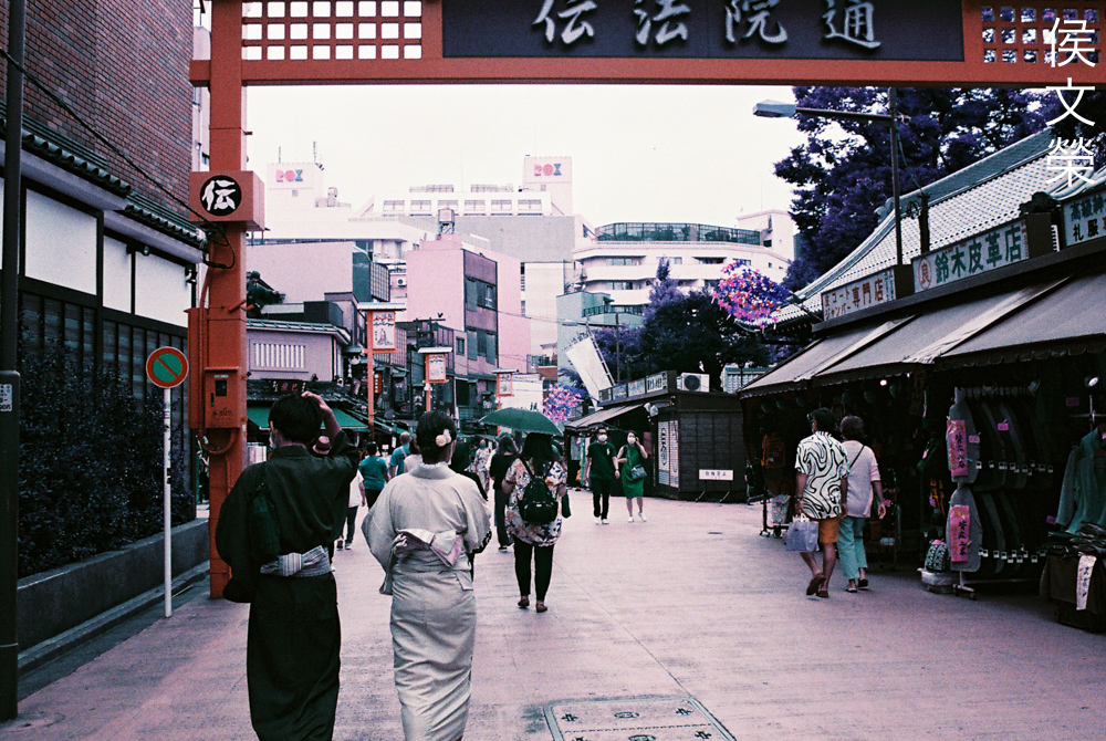
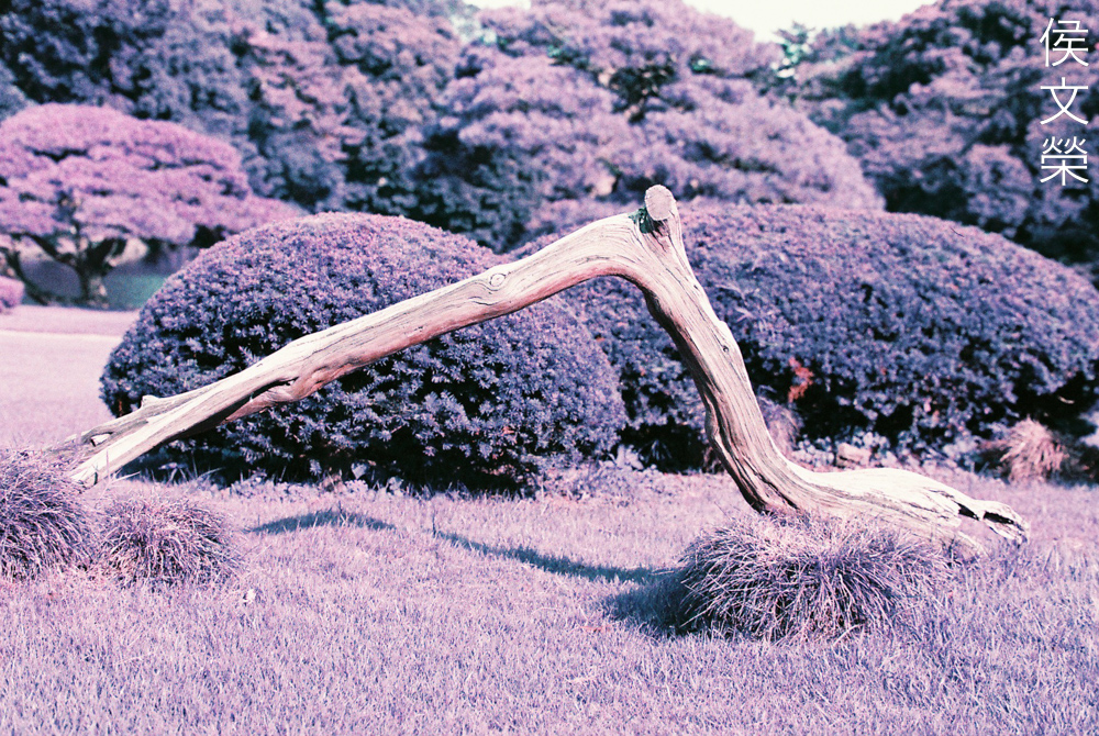
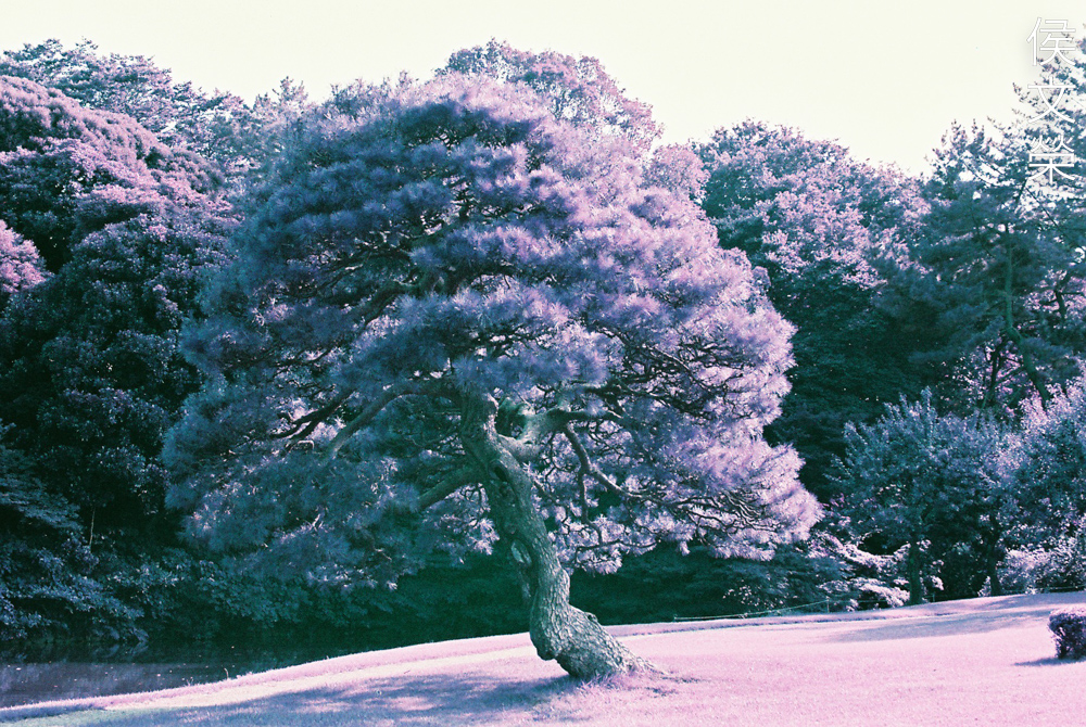
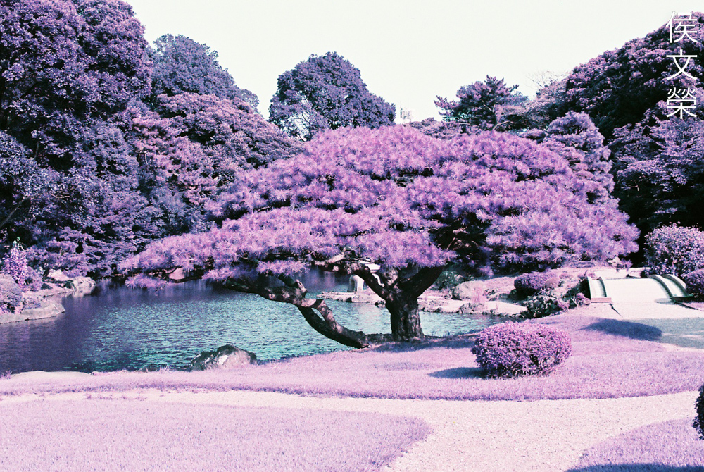
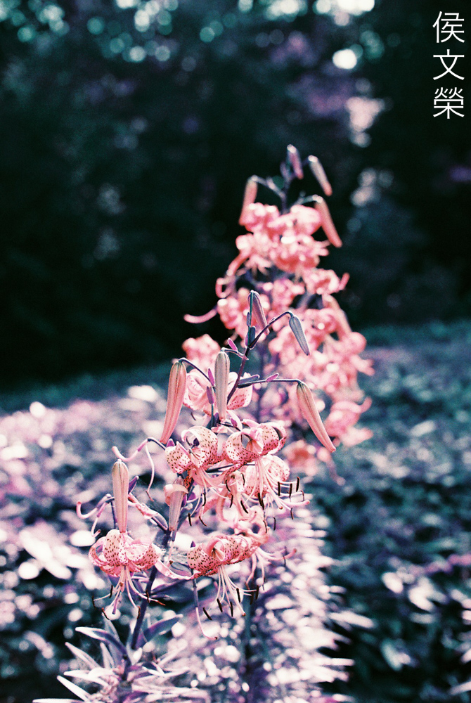
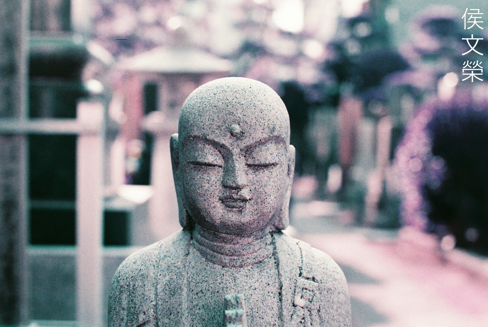
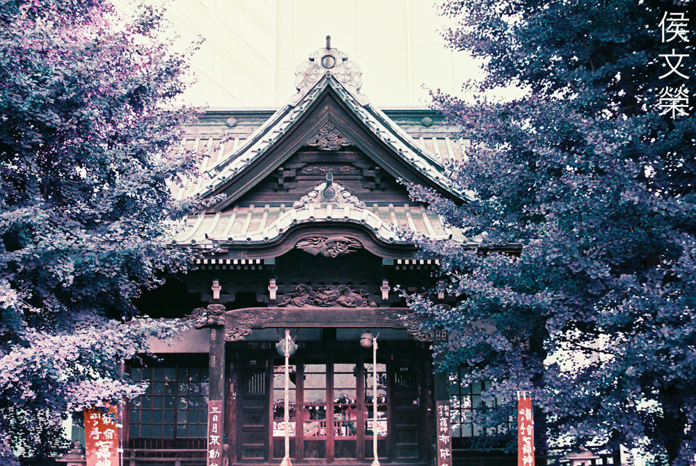
The biggest surprise you’ll see when you shoot foliage with this film is your greens will turn purple. Notice how the bronze figure at the center looks slightly purplish, too. This effect is most obvious on sunny days, I haven’t seen this happen as much in overcast or cloudy days and the foliage will just look like a dark and ugly mess. We’ll examine this further into this article.
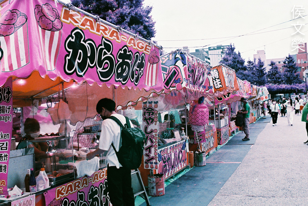
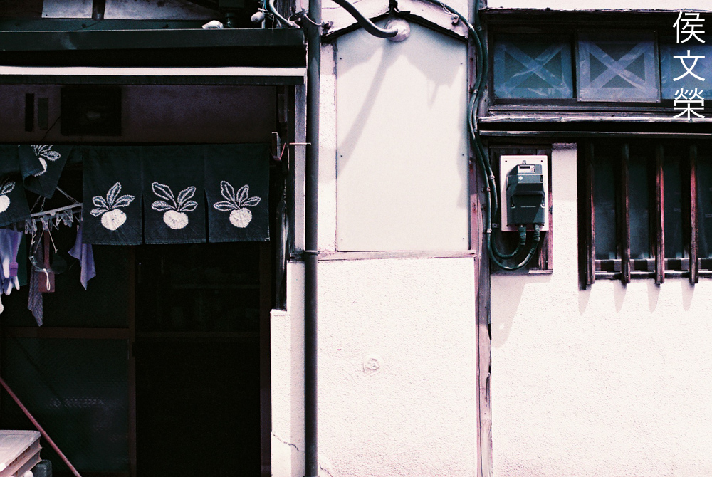
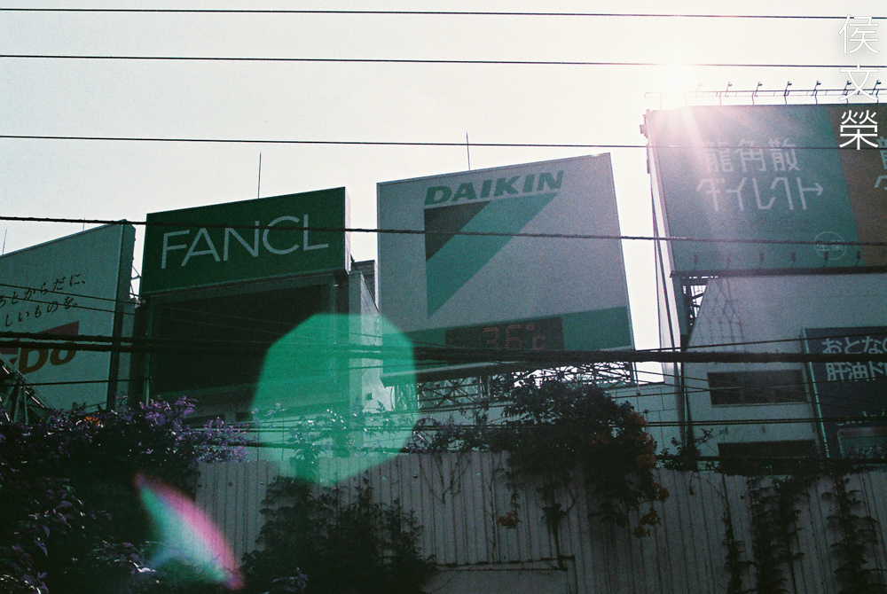
Yellows will turn pink or purplish, too. If I’m not mistaken, the closest booth is supposed to be yellow. It’s bright and saturated but this film rendered it purple.
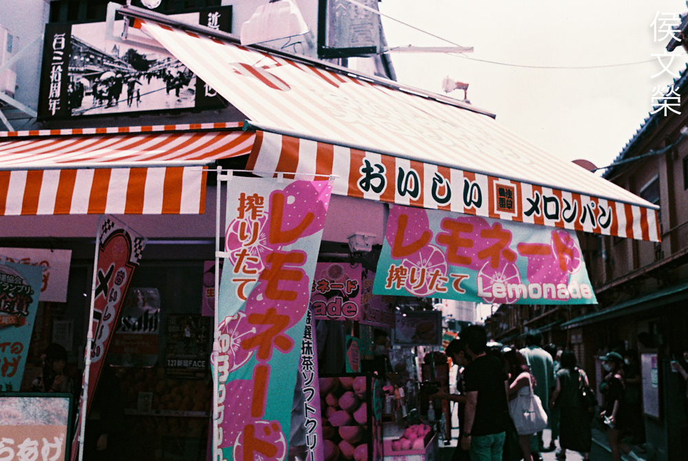
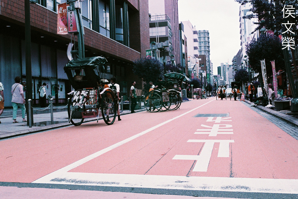
Another example is this lemonade stand, the lemons on the banner looks purplish. I don’t remember what the exact color of the blue parts are to be honest but I don’t remember them looking like this in reality.
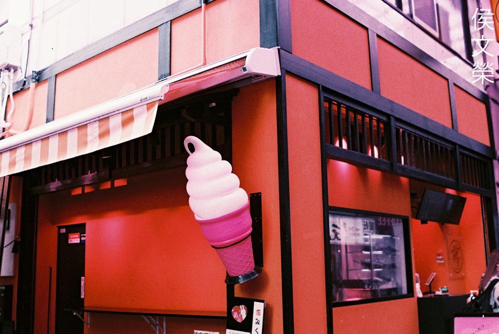
The walls look reddish in this photo and the cone now looks purple, really drastic changes that could be utilized creatively.
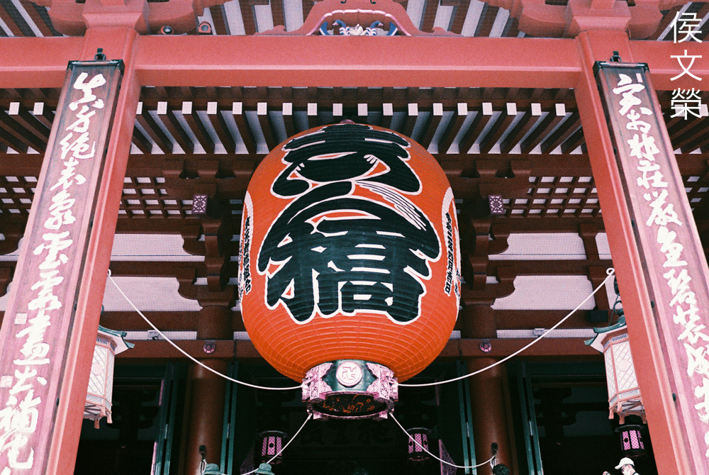
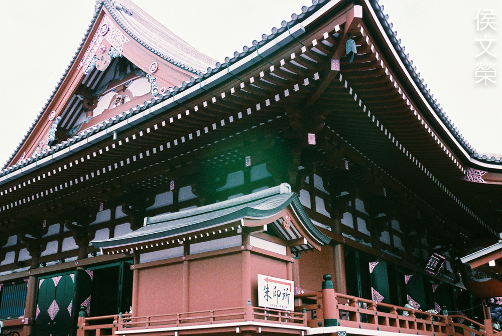
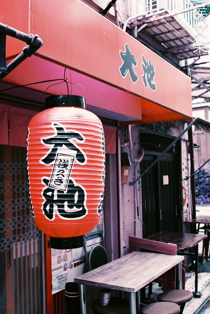
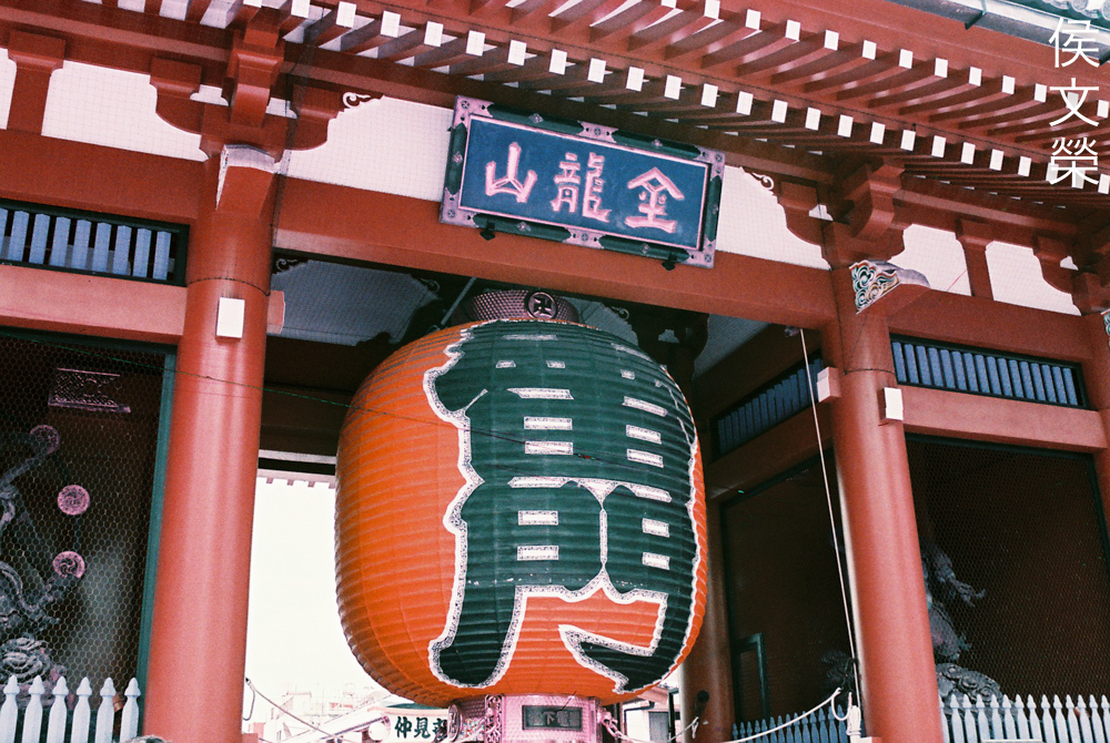
Reds won’t change much except for a slight drop in saturation.
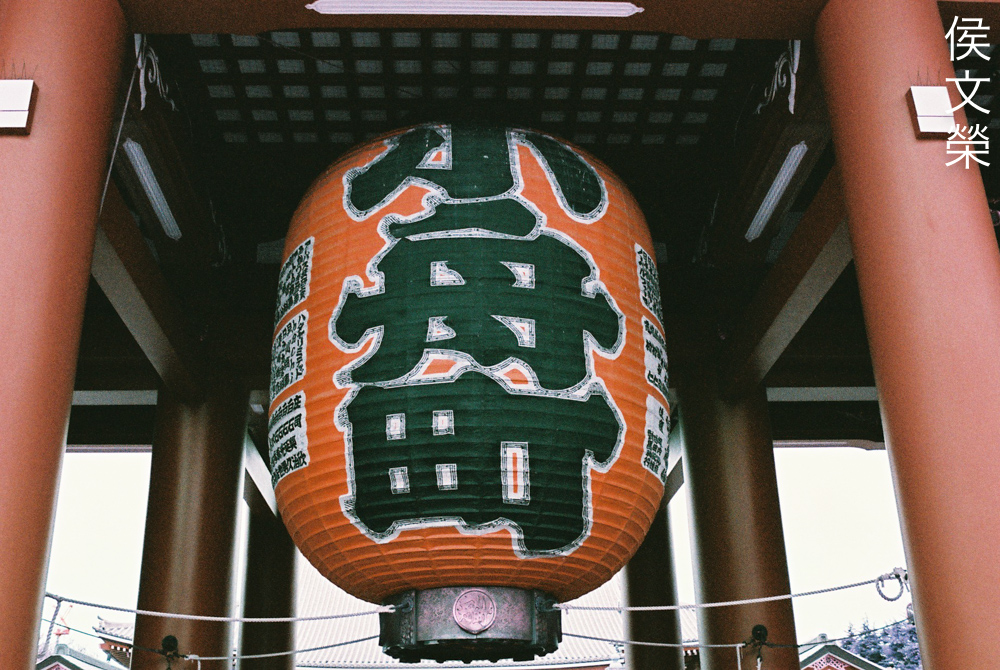
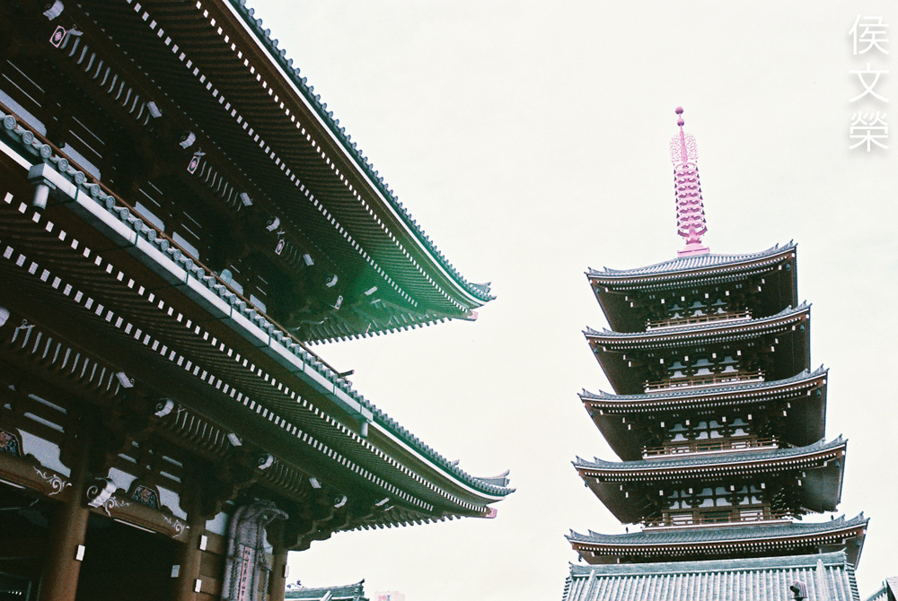
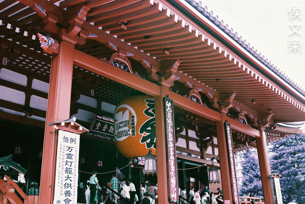
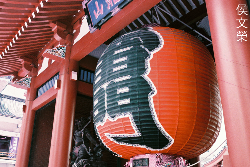
The bottom of the giant lantern is made of bronze so it looks kind of different here but the red elements in the scene remain reddish with a very slight shift in tone. Also note that this is grainy film and it’s easier to see the grain at the shadow areas.
Whites will remain whitish and any shift in color comes from ambient lighting or reflected colors from the sky or anything near the white objects.
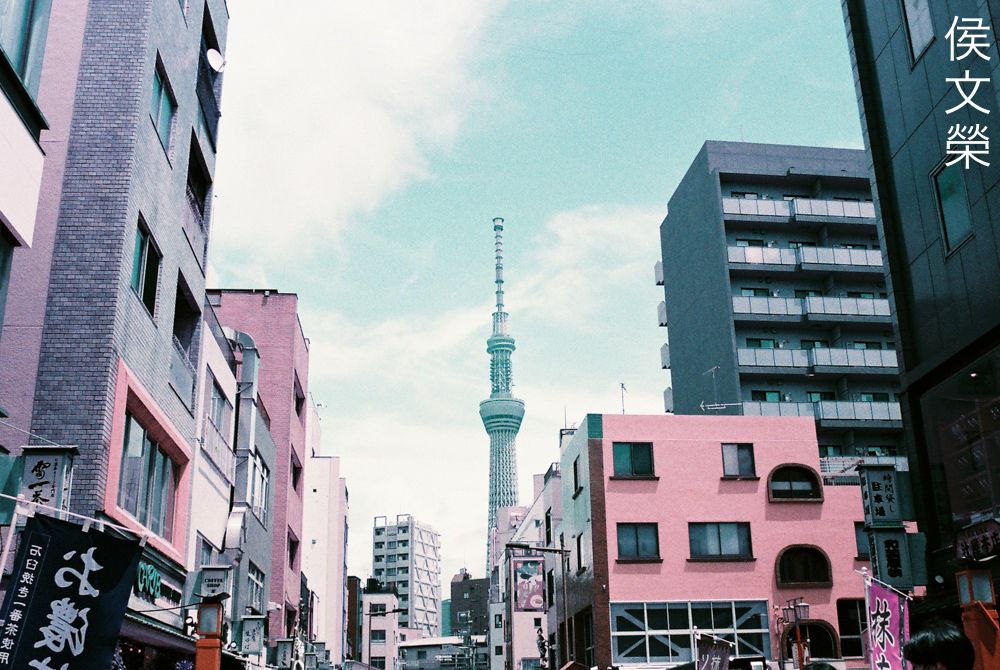
The bright blue sky now looks more like light cyan or teal. Using a polarizer will drastically make your sky look deeper, not only will that help in cutting down haze but it will also make your sky look richer.
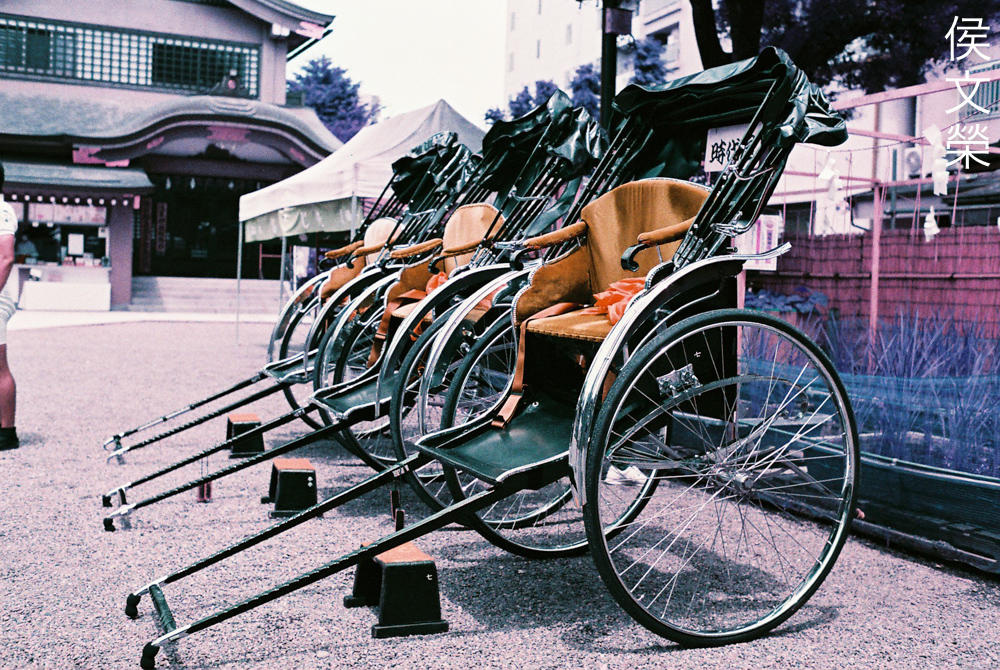
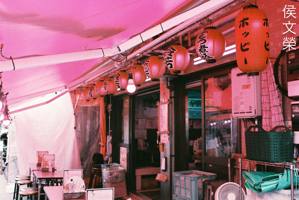
The red seats and stepping-stools now look brownish, very different from what they actually look like. It’s a nice photo if you ask me, it makes you guess how the scene actually is when shooting with your normal daylight film.
Dynamic range is good in my opinion so long as the exposure is within the film’s range. This is marketed as a “variable-ISO” film so it’s very forgiving when shooting in bright situations. The same is not true when shooting in lowlight as you will soon see.
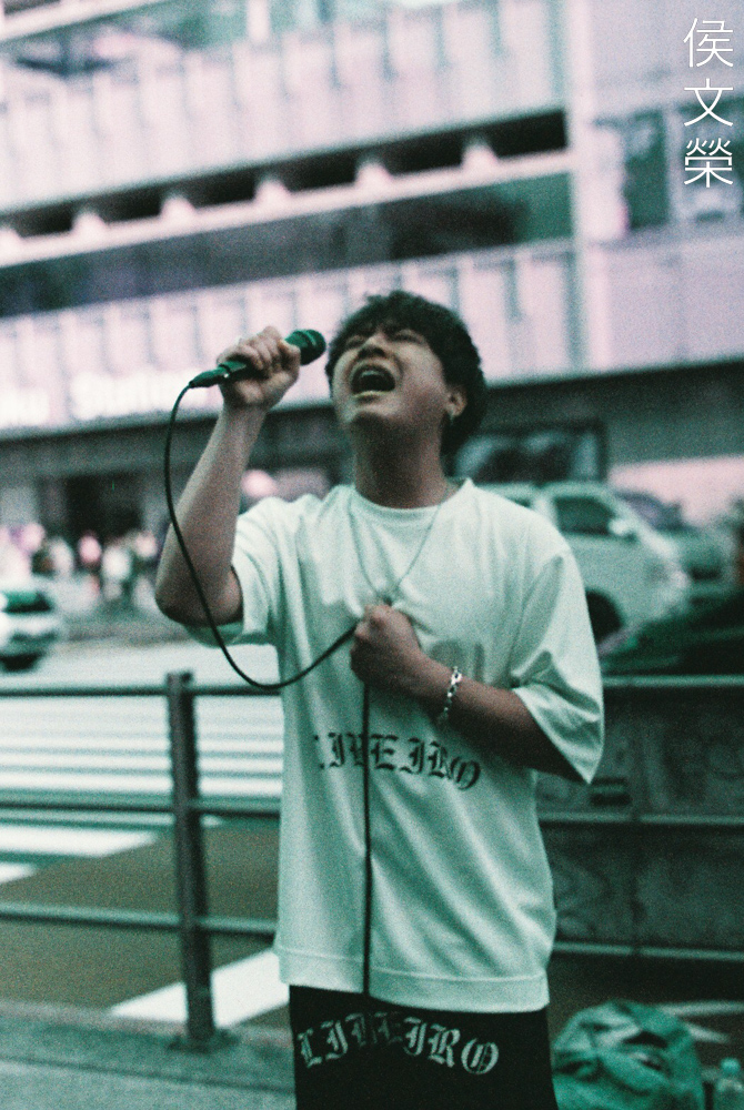
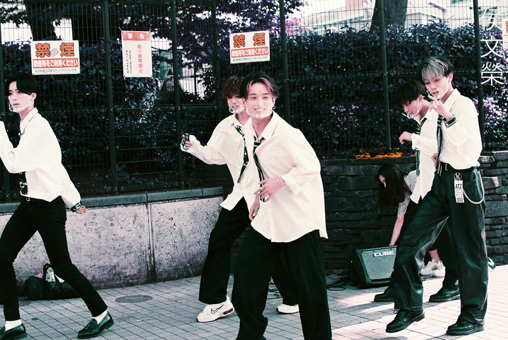
This is probably not a good film for street snaps but that doesn’t mean that you couldn’t use it. It’s just a matter of preferences, I personally do not like the tones that I get from this film when shooting people, I think it’s better for shooting landscapes or any hipster-themed photos instead.
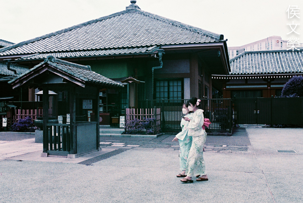
It’s not all that bad it’s just that I’m used to a brighter color palette. If you want the skin of the people you shoot to remain skin-like I’d suggest using a flash with a low output and fit a gel on it to help compensate for any shifts that would make the color of your subjects’ skin look unnatural.
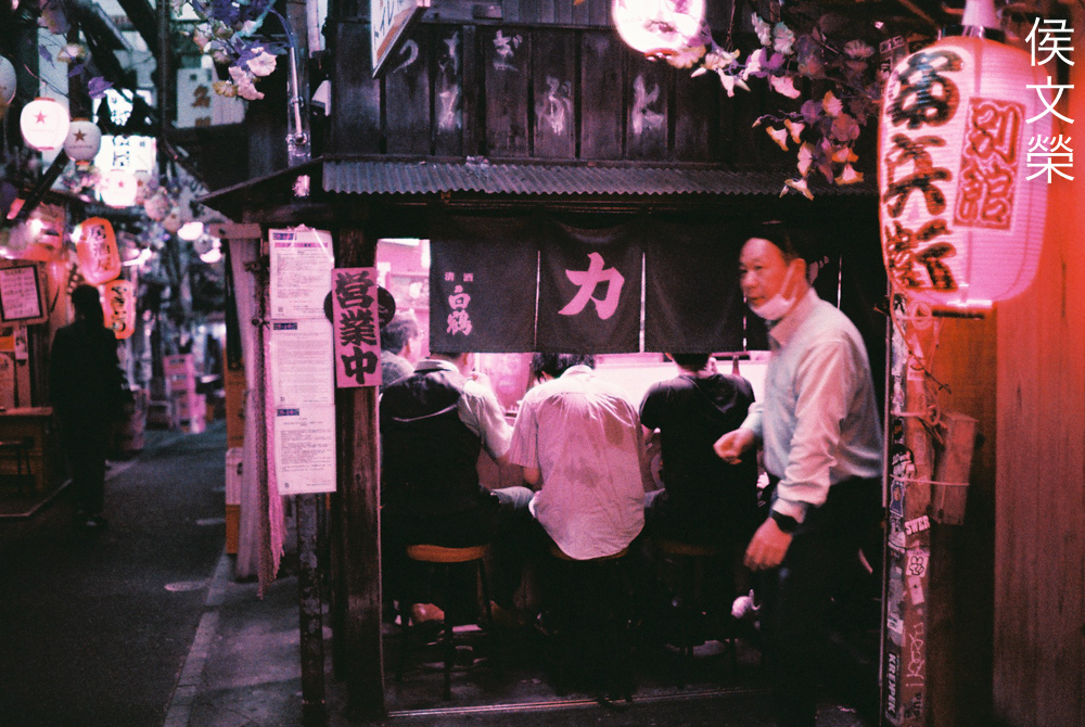
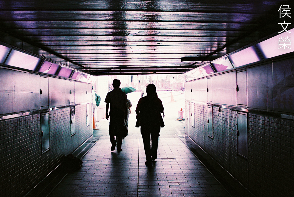
You will need a spot-meter in order to get the right exposure for shooting in lowlight situations. Even with that you will need to anticipate any changes to your exposure so it’s best to overexpose by a stop or less. This will prevent your scene from looking like what you see here. Needless to say, it’s best to rate this film at ISO50-100 when shooting in the dark.
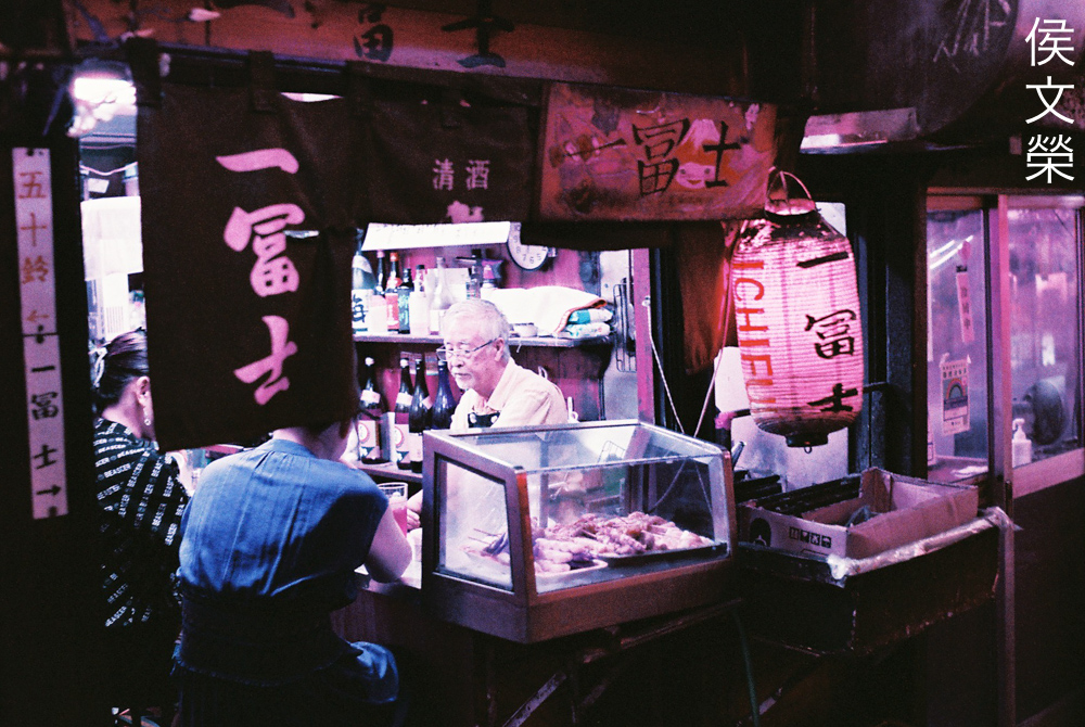
This is what you will get when you expose this properly when shooting in lowlight situations. This looks a bit overexposed since I wasn’t metering for the gentleman at the middle, if I did that we won’t be able to see the darker parts of this scene. Shooting at dark places is very tricky and only experience will guide you on how to meter the scene effectively.
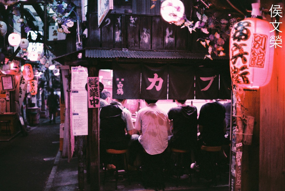
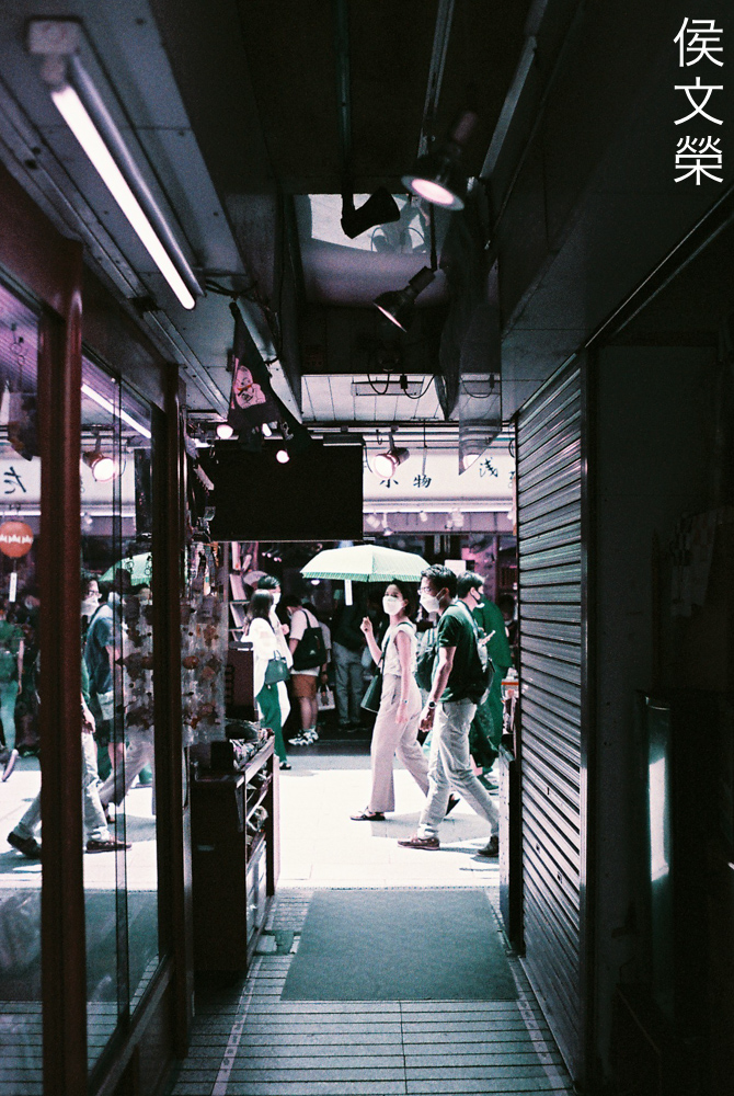
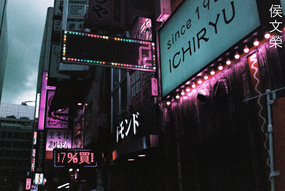
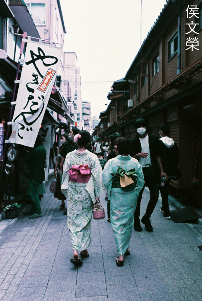
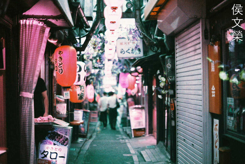
If you’re a regular in my site then this part of the alley should be familiar to you. I like this corner a lot but this film doesn’t capture how lovely this scene is in reality.
This is not the best film for shooting these kinds of photos, I’d even say that it’s better to avoid using this film when shooting neon-filled alleys. Read my Fujifilm Natura 1600 and Cinestill 800T articles instead to see why I’d prefer them over this specialty film from Lomography for these kinds of shots.
(Click to enlarge)
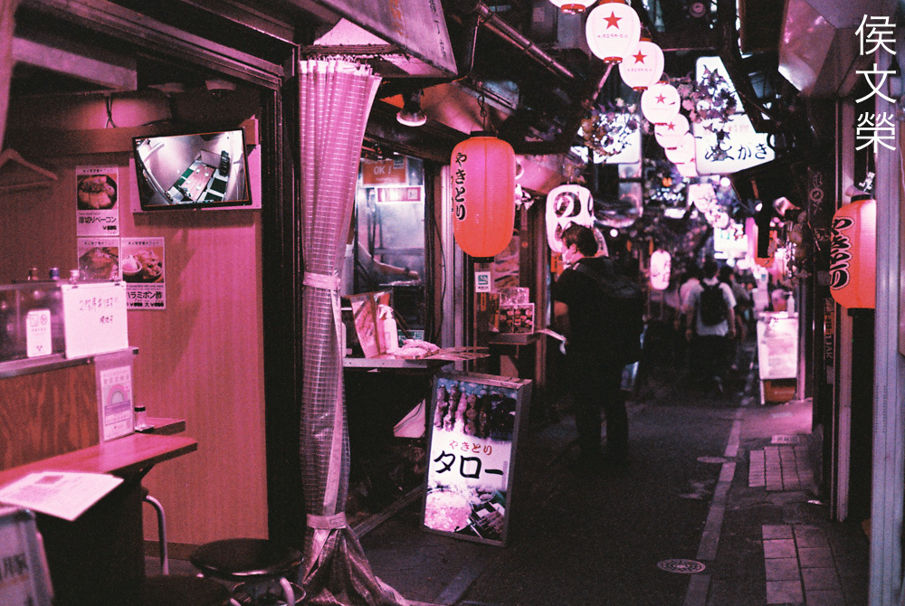
Here are more pictures for you to examine. I wonder how this film renders when you attach a colored filter on your lens, perhaps you’ll get an even more interesting effect. It is certainly unique and I think this is the best film Lomography has ever made. I find it to be versatile, the results are unexpected but it a good way, unlike the Lomography LomoChrome Metropolis 100-400 which is a bit hit-or-miss.
Wait, there’s more!
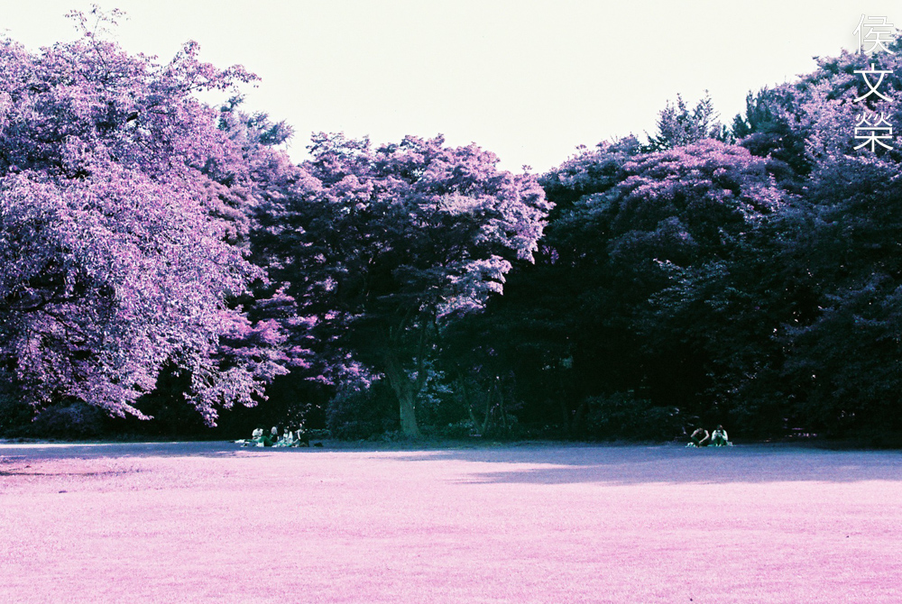
Since I was enjoying shooting with it I’ve decided to shoot another roll. We have established that it turns green into purple I felt a bit curious and went to the park to shoot some foliage just to see how it looks. There’s a couple of more tests that I wanted to do so I took this chance to see what I needed to see.
Your choice of film will not affect how internal reflections look like apart from altering their color. I took this to see if it is indeed sensitive to infrared but I did not get any hotspots. This rule-out that the source of the hotspot we saw awhile ago is caused by the lens.
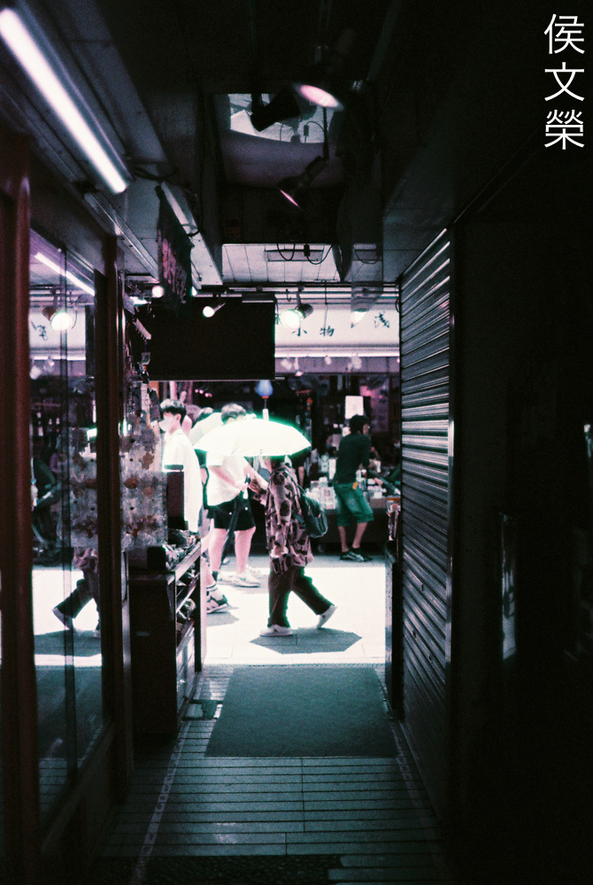
I don’t think this film is good for lowlight photography, at least in the sense that I do it. I am pretty sure that it will look weird in a bad way because I will lose the variety of subtle tones that I get from ambient illumination from neon and other sources. This does hold well when it comes to handling grain, though.
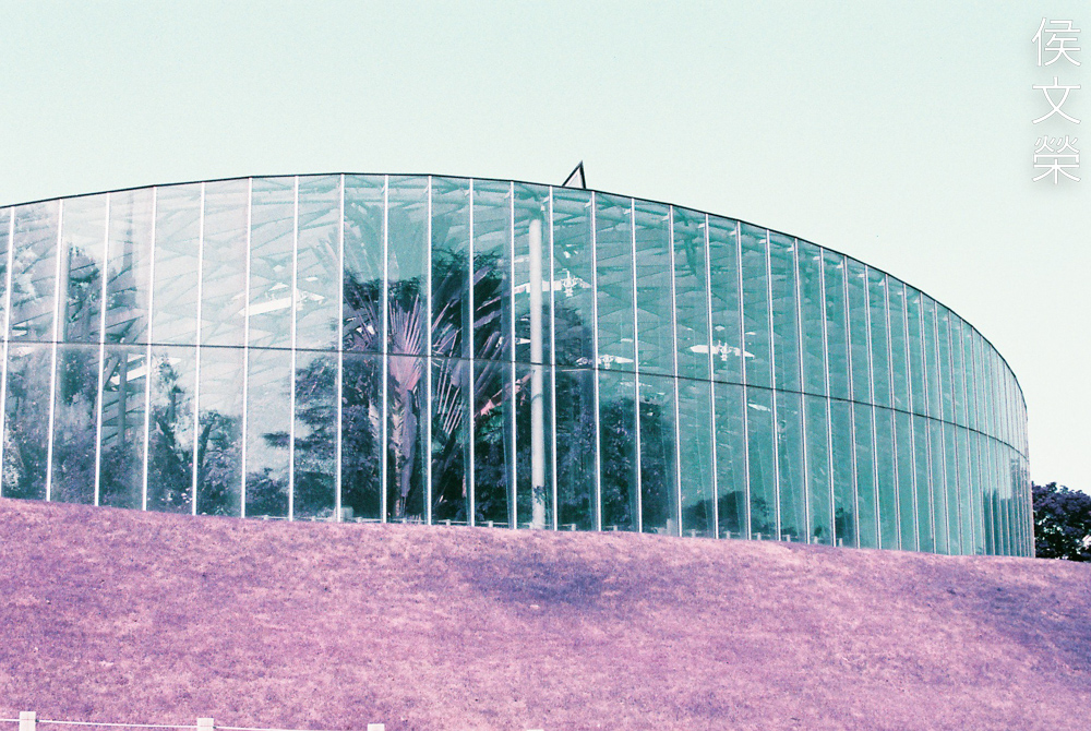
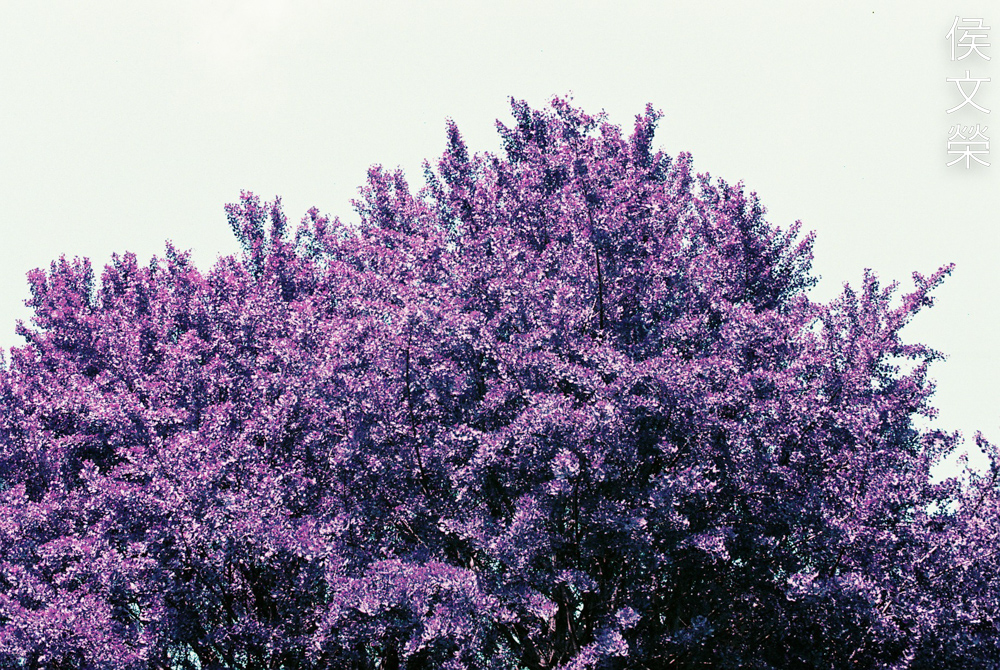
As expected, the greens in my shot are all tinted purple. It’s also worth noting that the intensity of this effect is mostly dependent on the position of your light source as you will see in the next photo.
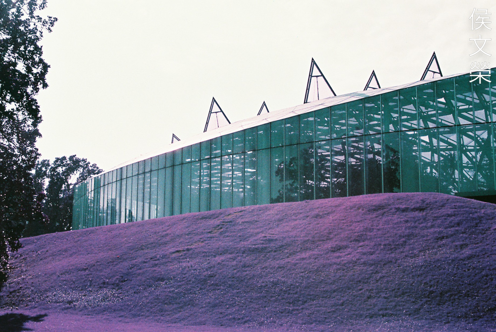
I shot the same building but from the other side, notice how intense the purple looks this time. Underexposing also helps bring this effect out, at least this is what I’ve noticed.
(Click to enlarge)
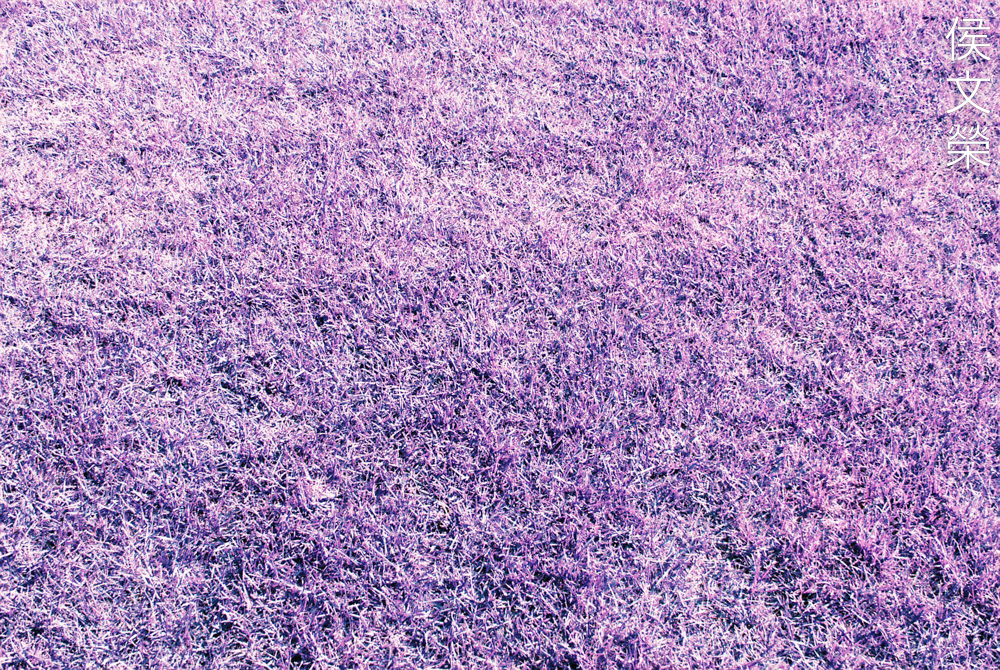
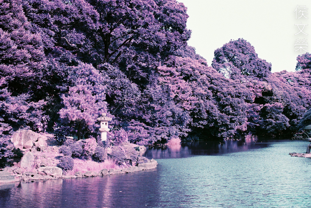
Varying textures and shapes will also determine the intensity of the effect. Leaves have a waxy coat which reflect light, acting like small mirrors. Keep this in mind so you can predict your results better.
(Click to enlarge)
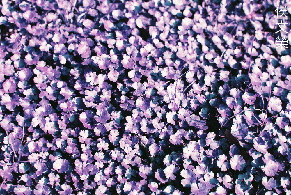
Here are more photos of greenery. Observe how this film alters thee look of the green layer, just remember that the intensity of the effect is dependent on the shape, texture and size of the leaves.
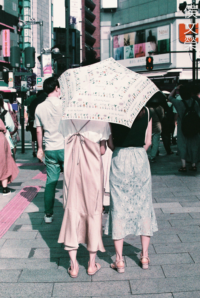
Shooting in grey, urban settings is not what this film is about in my opinion. It loses its magic and becomes kind of boring. Notice how it renders skin, it’s not unpleasant but certainly not pleasing either. The good thing is it won’t make your subjects look weird, it will just make them look like they’re in an old, weathered photo.
(Click to enlarge)
Not a good film for street photography of this sort, maybe I should have just stuck to shooting people at the temple grounds. I am not saying that it’s useless for this application, it’s just not what I wanted. The only takeaway from these photos is we can observe how it renders skin at different light characteristics.
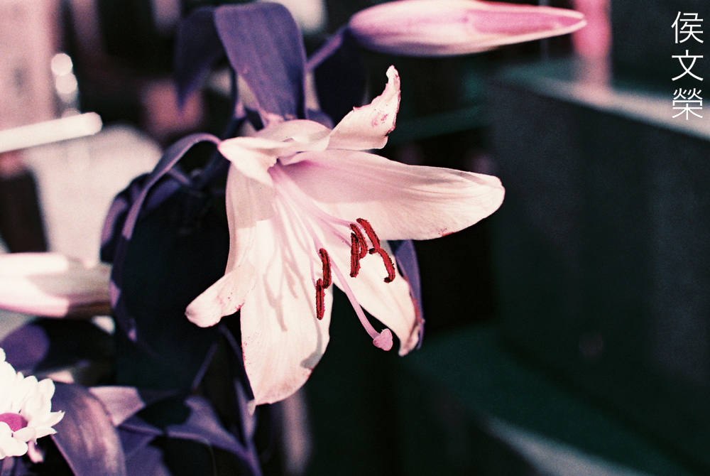
I don’t think this film is suited for shooting flowers at all because it will try to change the tone to make it look monochromatic in a bad way.
Not many people realize this but film grain will affect the look of your out-of-focus details. This is by no means a fine-grain film so it will help in breaking down the blurry parts even further to a small extent but it is enough to blur any ugly edges formed by the lens such as irregularities and concentric rings caused by aspherical elements that were not shaped by-hand.
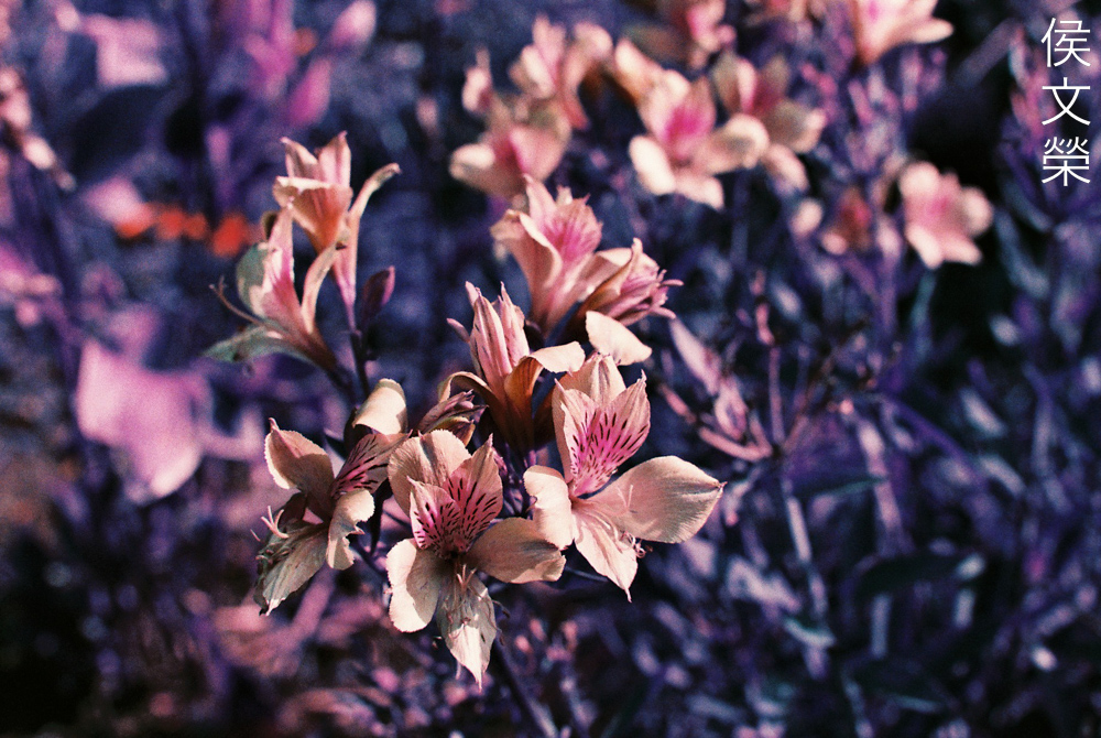
And here’s another example. I was merely curious so I took these flower photos but now that I’ve seen these I don’t think it was a bright idea.
The structure of the grain looks typical for a film of this type but I feel that it is slightly on the grainier side, not unpleasant but it’s something that you should also consider.

(Click to enlarge)
Here’s the rest of the roll. I find this more versatile than the Lomography LomoChrome Metropolis 100-400, it’s actually ironic that I said that because this film alters your photos in a more drastic way but the results look more pleasing. This set should give you an idea as to how versatile it is as it covers a lot of scenarios and light characteristics.
This is a popular but specialized film, I don’t see myself using it thing often. It’s not cheap either, it is probably nice to shoot with when you know what you want to get out of it but otherwise I would never ever use this on a whim because of the cost. I see a lot of potential and it will certainly benefit those who shoot professionally but one has to be aware of its inherent graininess, if I will ever use this for a job the best way is to use the 120 version because the graininess won’t be much of a problem. I assume that this film will look stunning in that format. I highly suggest trying it out just for fun’s sake, it’s fine to get out of our own comfort zones once in a while and just embrace the imperfect and unpredictable world. We may even find something that is more to our liking this way, maybe even life-changing.
If you like this article please share it with your friends. This site exclusively earns money from views which is a paltry few cents each day but thankfully some of you are helping me out with its upkeep. Purchasing, processing and having film professionally scanned all takes a lot of money these days and you’re helping me offset the cost of producing these kinds of articles. You’re the reason why this site has lasted for years and it will continue to educate and entertain people long after I’m gone. Thank you very much and keep on shooting. Ric.
Help Support this Blog:
Maintaining this requires resources and a lot of time. If you think that it has helped you or you want to show your support by helping with the site’s upkeep, you can make a small donation to my paypal.com at richardHaw888@gmail.com. Money isn’t my prime motivation for this blog and I believe that I have enough to run this but you can help me make this site (and the companion facebook page) grow.
Buy me a roll of film or a burger?
Thank you very much for your continued support!
$2.00
Helping support this site will ensure that this will be kept going as long as I have the time and energy for this. I would appreciate it if you just leave out your name or details like your country’s name or other information so that the donations will totally be anonymous. This is a labor of love and I intend to keep it that way for as long as I can. Ric.

Dec 03, 2022 @ 15:25:09
Very interesting effects 😉 I find the photos color shift to be very similar to the old Kodak Aerochrome false color IR film of the 1970’s … Thank you for the review, I may give this odd film a try.
Dec 03, 2022 @ 17:50:49
👌👌👌📷
Dec 21, 2022 @ 15:04:55
Hey Richard, welcome back! So glad to see another article from you. (which I haven’t read yet, just went straight for the comment section as soon as I saw this in my RSS reader – which I don’t check often enough, it seems)