
Hello, everybody! It’s been a couple of months now since I have left Tokyo in order to live elsewhere. It’s not easy to say goodbye to a place that I called home for more than a decade or 12 years to be exact. All the preparation and expenses made me stressed but at least my daughter might be happier here in our new home. I think it is fitting that I dedicate this post to Tokyo, an amazing city that had been part of my family’s life. Please enjoy this little article.
Introduction:
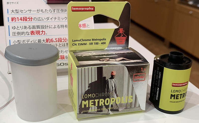
The Lomography LomoChrome Metropolis 100-400 (Tokyo Edition) is a limited-edition film made with the collaboration of Kitamura Camera in Japan a few years ago. As the name implies, it’s a variable-ISO film which means it can be used within the specified range and you will still be able to get good results which makes this a very forgiving film to shoot with. You can rate it however you want so long as you don’t stray too far from the recommended range. This is probably a repackaged Lomography Metropolis 100-400 since I could not see any difference with shooting both films. Maybe they just want to get rid of inventory that’s been sitting in the warehouse for years, I don’t know.
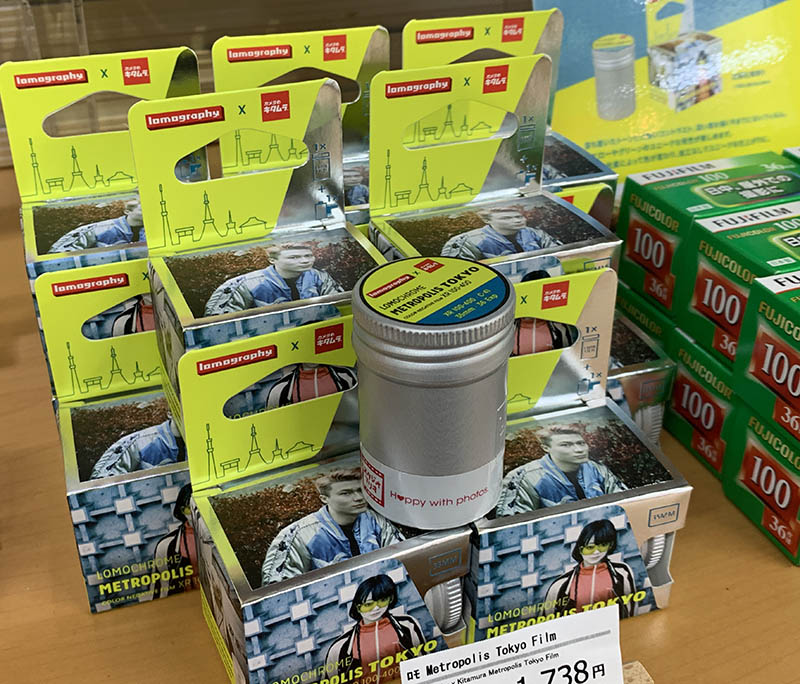
Unlike Lomography’s normal line of hipster films this one comes with a premium aluminum tin. Packaging is important for sales and brand-image and they went all-out this time. Do not be fooled by the pictures on the box, you’ll only get these results if you’ve shot the film under the right conditions and I will show you how you can get it or at least understand how this film behaves. There is a slight difference when you use it at different speeds and only at certain conditions.
This is one of the more expensive stocks available, I do not recommend that you shoot this for fun. It is certainly not a pedestrian film in price or results. It’s a specialty film for those who can afford buying a cup of expensive coffee that costs more than the shirt that I wear. It’s all about image if you ask me and if that means more to you than anything then this film is waving at you.
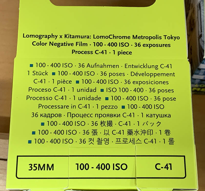
Some laboratories won’t process these thinking that it’s a special film that will ruin their chemistry and machines but it’s just your normal C41 process film, it’s no different from the cheap Kodak films that you can buy from drugstores not too long ago such as the Kodak Gold 200. If thee guy at the counter won’t accept your roll simply educate him by showing the back of the box.
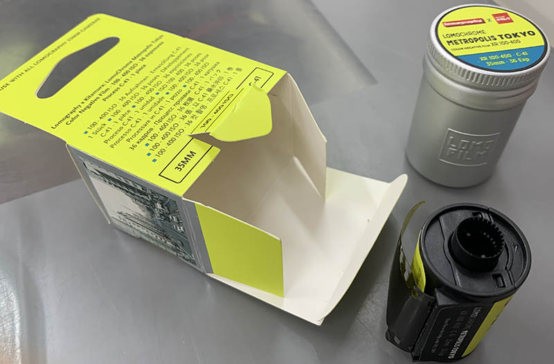
The cartridge is made of plastic and it doesn’t look cheap, too. The tin looks useful, maybe I can use this for storing my medication or even some weed.
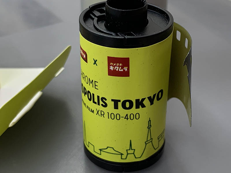
What’s unique to this company is the color of their base, it’s yellowish compared to the usual amber that’s kind of the standard for most films.
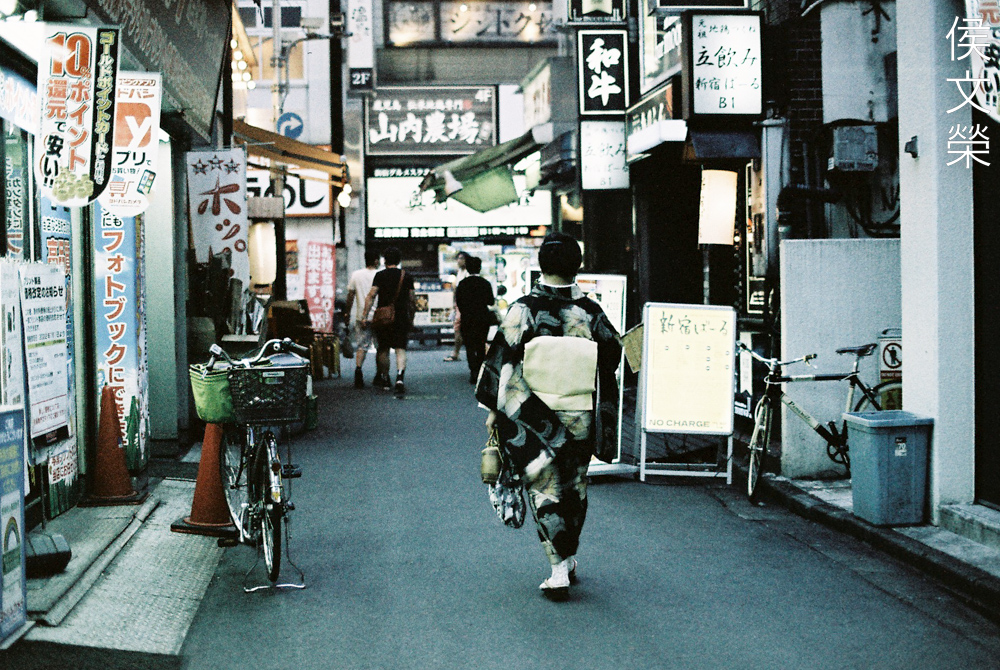
It’s now time to see some photos. These were shot with my Nikon FM3A and my Nikkor 35mm f/1.4 Ai-S, I guess this is the best combination for just going out and having fun, a light but capable setup.
(Click to enlarge)
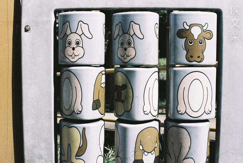
I shot these from ISO’s 100, 200 and 400. Its saturation won’t change much unlike some of Lomography’s films but their is a very subtle change in character specially if you look near the shadows.
(Click to enlarge)
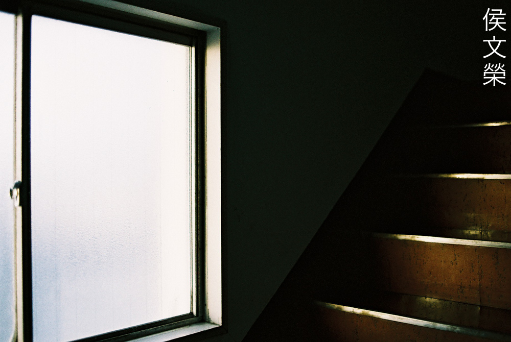
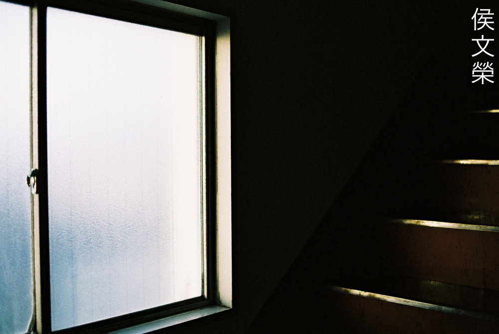
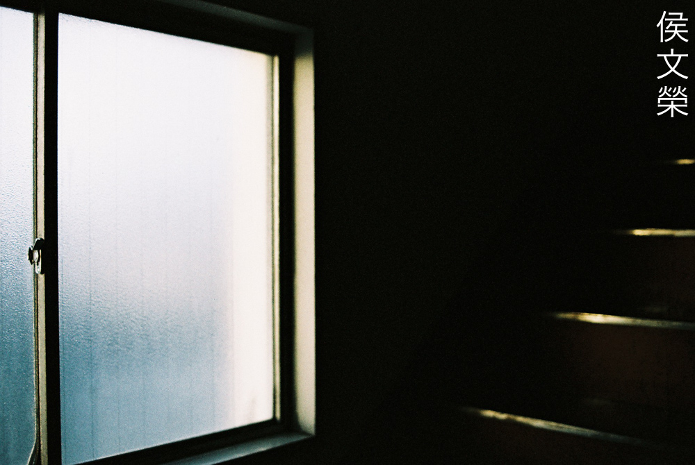
These were shot at both ends of the recommended ISO range when shot at night. Despite the advertised effect this film does the opposite in my experience, it seems to subdue the yellow tint of the photos which is most obvious when you are shooting yellow objects, giving you an unsaturated look that mimics what is usually seen in expired rolls of film.
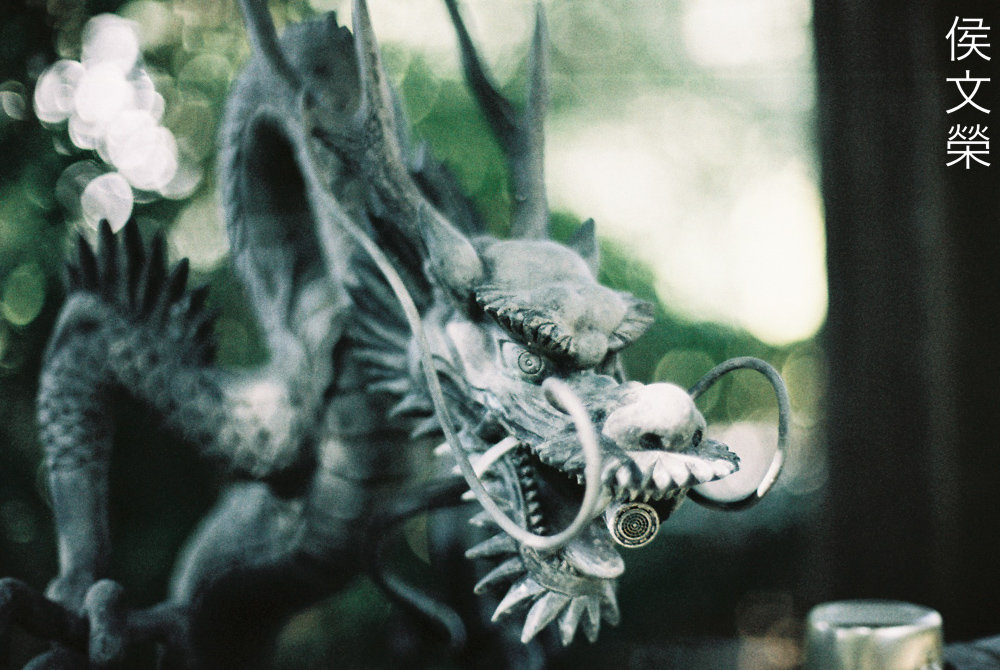
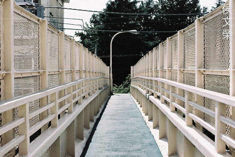
The following photos were shot with the film rated at ISO200. These pictures should give you an idea on how this film behaves in real-world scenarios.
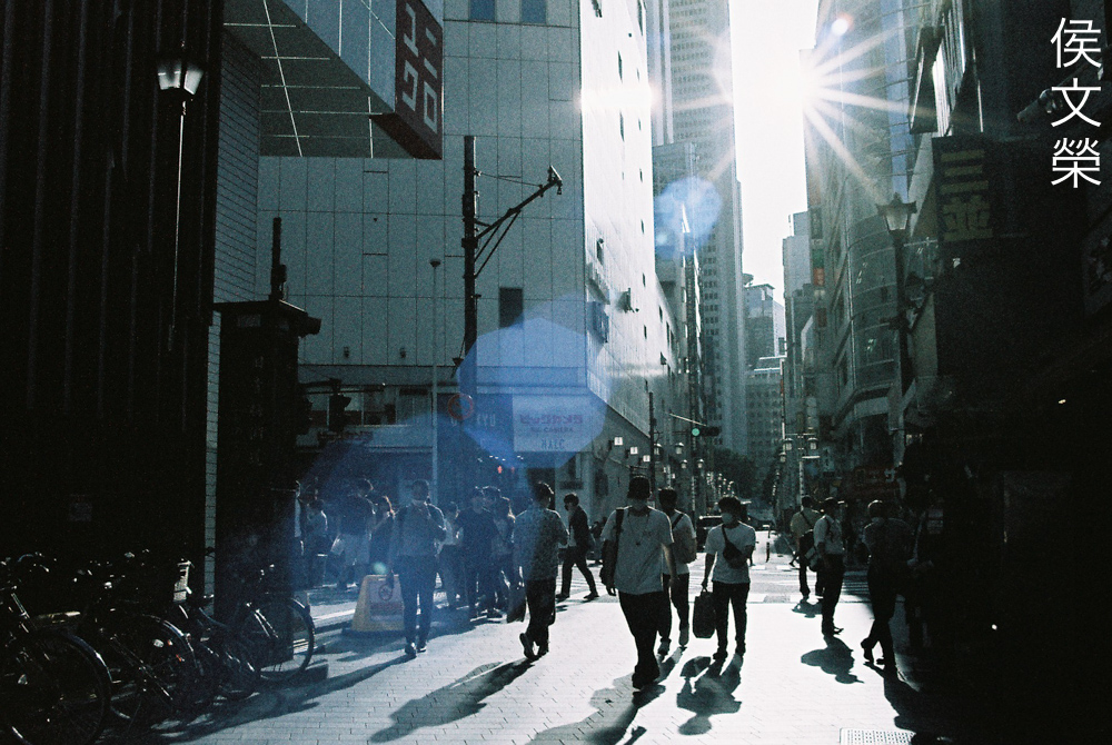
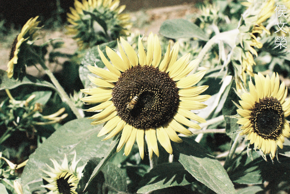
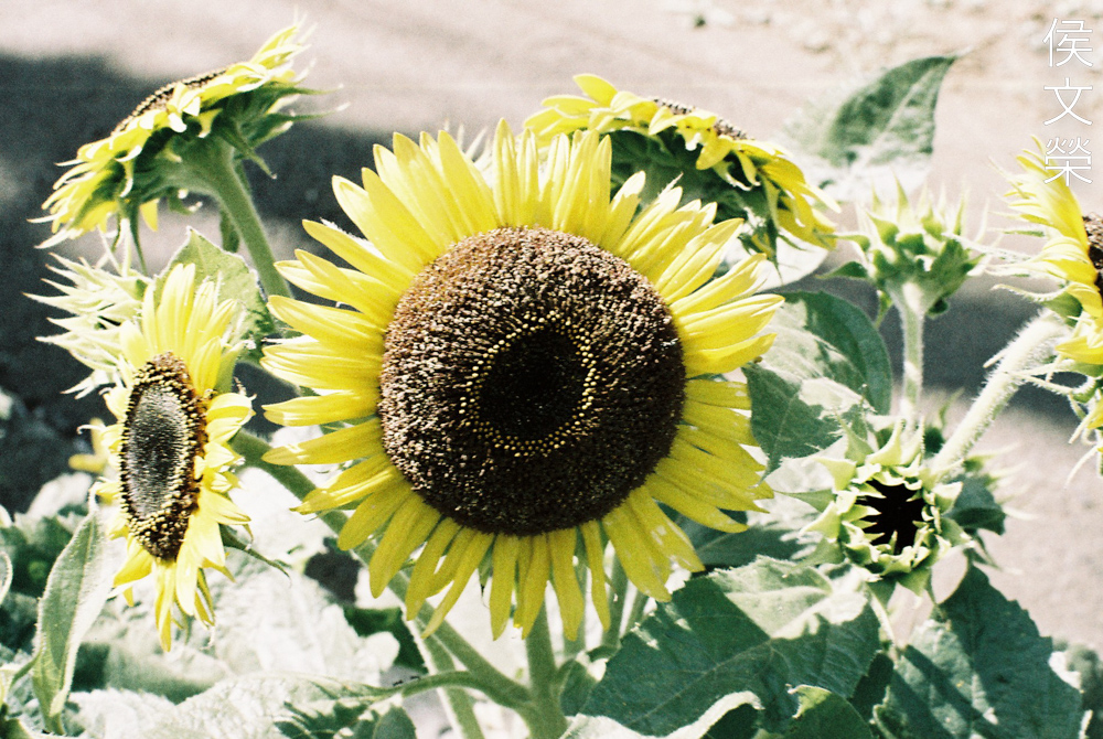
I took this to show you how it renders different colors when shooting in sunny conditions. This has a muted feel to it which makes your photos look unique. We would shoot expired rolls back then just to achieve a similar look. Some people gravitate towards this look, according to recent studies, experts claim that the amount of words or adjectives in your coffee’s name has some correlation to your tendencies to like these sort of things
(Click to enlarge)
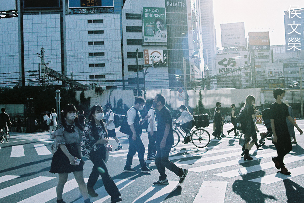
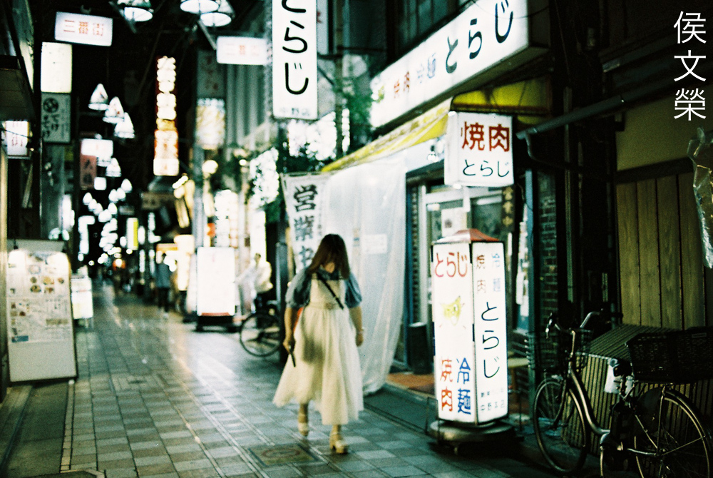
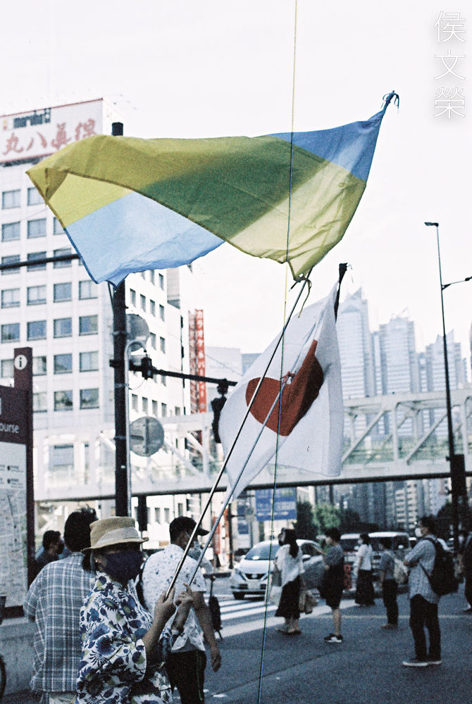
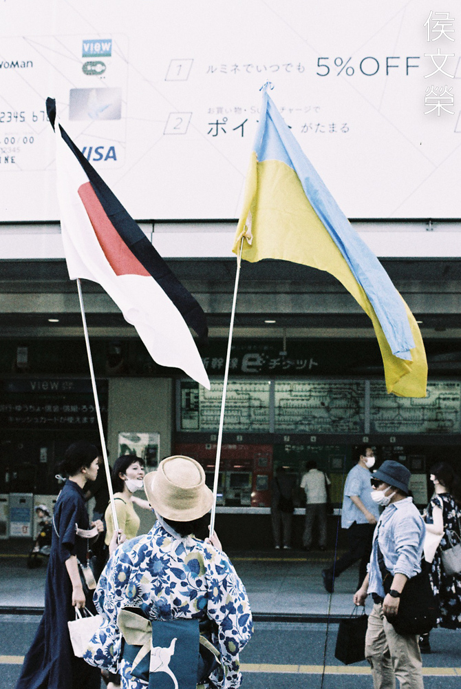
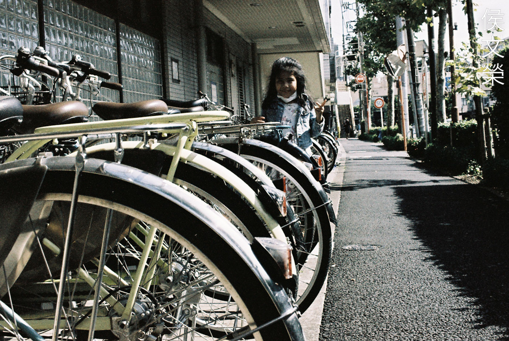
The hot summer afternoon don’t look so hot since the yellows are subdued, giving you a surreal look. It’s nice to see these familiar places look a little bit different due to the shift in hue and saturation. The yellow parts of the scene looks like they were flipped to the opposite range of the spectrum, making them look a bit more bluish. It doesn’t look good when shooting people since the skin will look bluish under strong or direct sunlight.
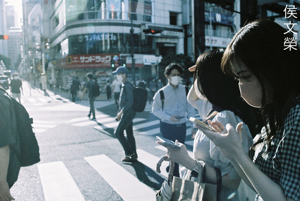
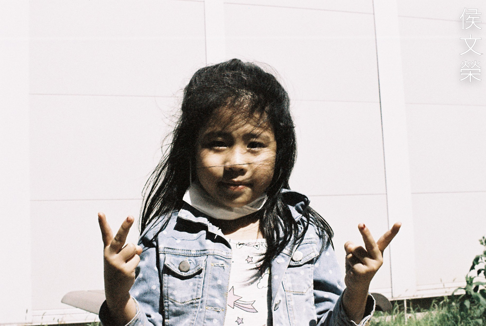
I personally do not like this look when rendering skin, you can probably offset this with the use of filters, I think amber or yellow should neutralize the effects of this film which can help you retain the color of the skin better.
Overexposing skin isn’t going to help at all unless this is the look that you are after. This film does something when rendering skin under bright and sunny conditions.
Underexposing a bit seems to help somewhat if you want the skin to look a little bit more natural. I would say 2 full stops is a good starting point when shooting people under harsh sunlight. This is probably why the models in the box looks like they were under overcast conditions.
This photo would normally look a lot warmer when shot with your usual daylight film. It feels like I’ve put a cool filter over my lens.
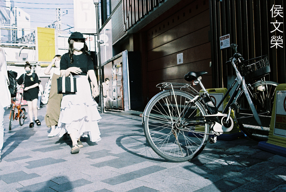
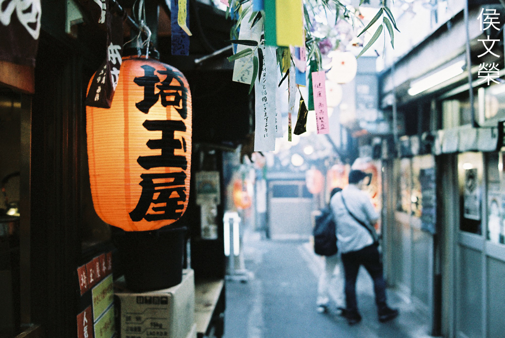
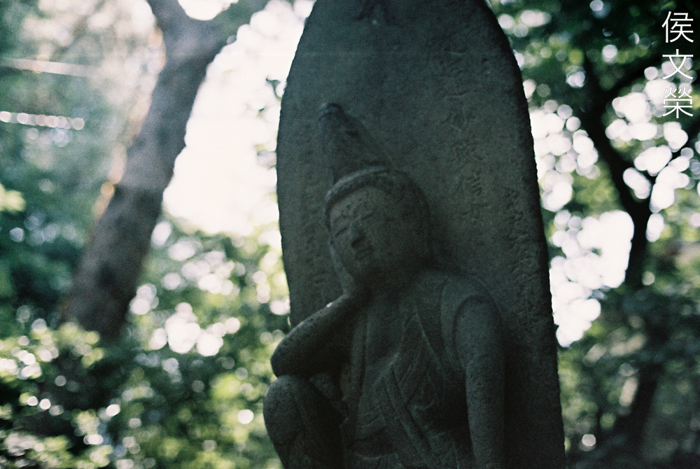
Let’s now see how this film renders when shot in the shade or at least, far from direct sunlight. I hope that it behaves better under these conditions.
(Click to enlarge)
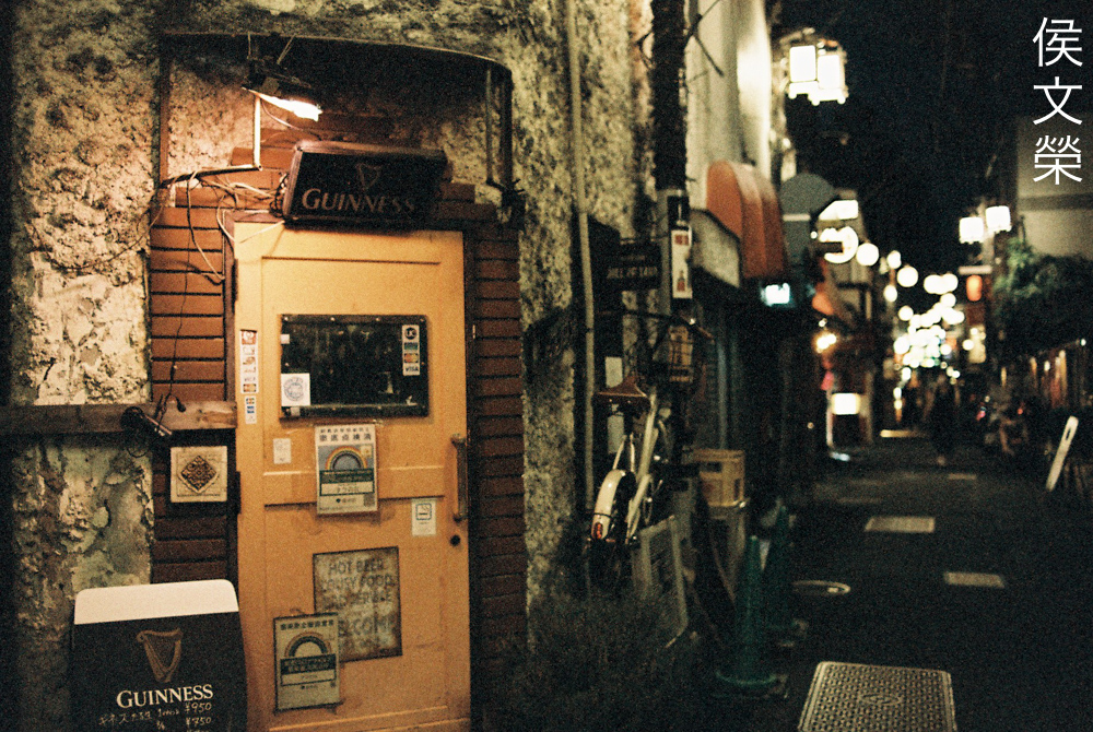
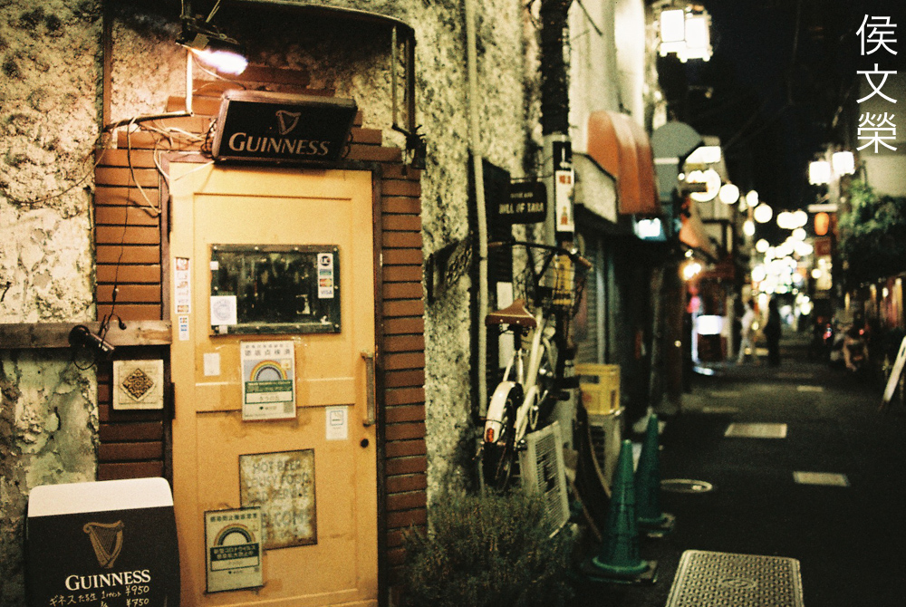
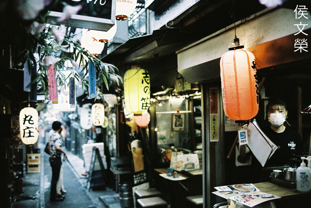
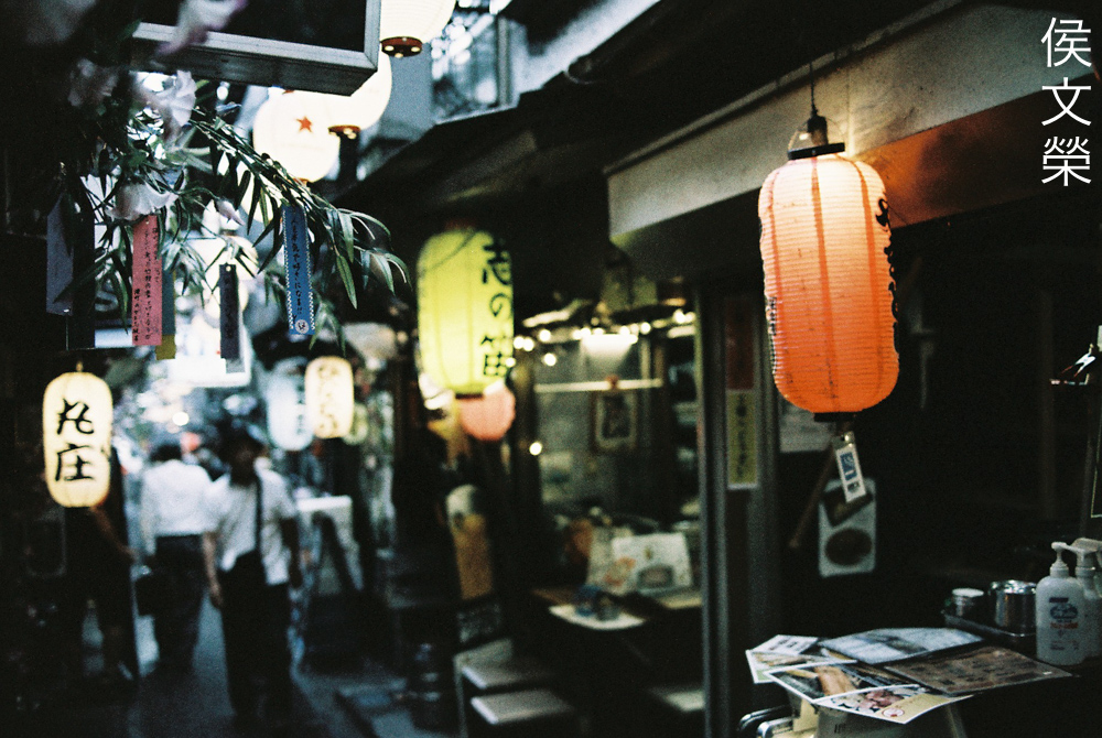
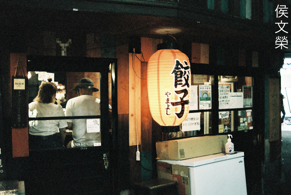
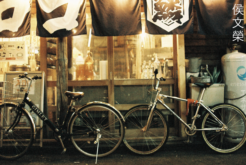
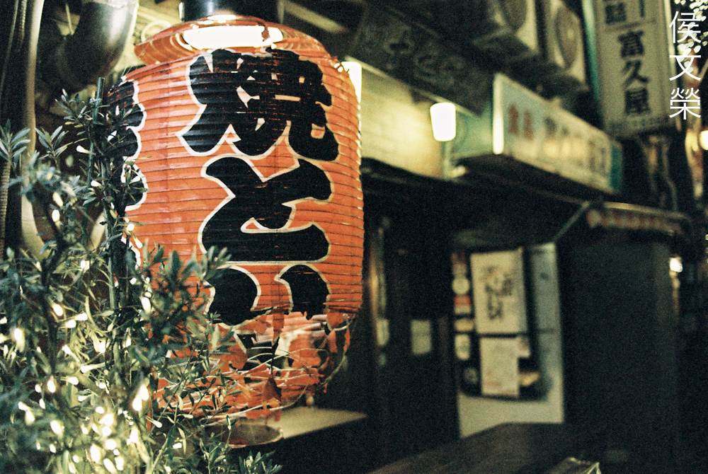
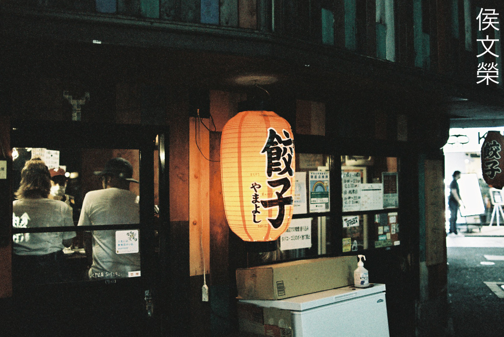
The vivid colors of the lanterns now look a lot more pale but skin seems to retain much of the yellow tint when shot in the shade or under artificial light.

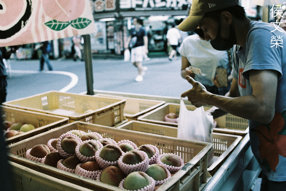
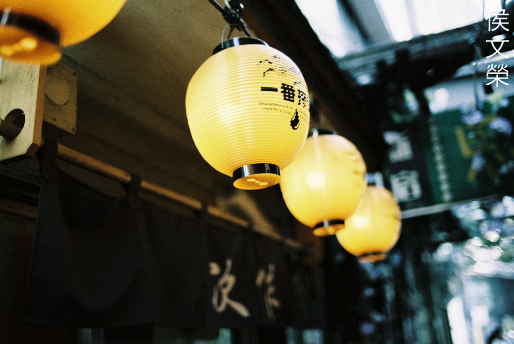
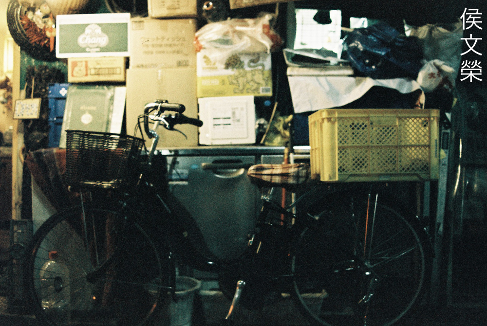
The crates are vivid yellow which is further enhanced by the yellow lamp but the film made it look desaturated. It sure does give a unique look but I am not interested in this look at all, I will never use this for journalism if I were you.
This one looks a lot better but it’s still not something that I’d want.
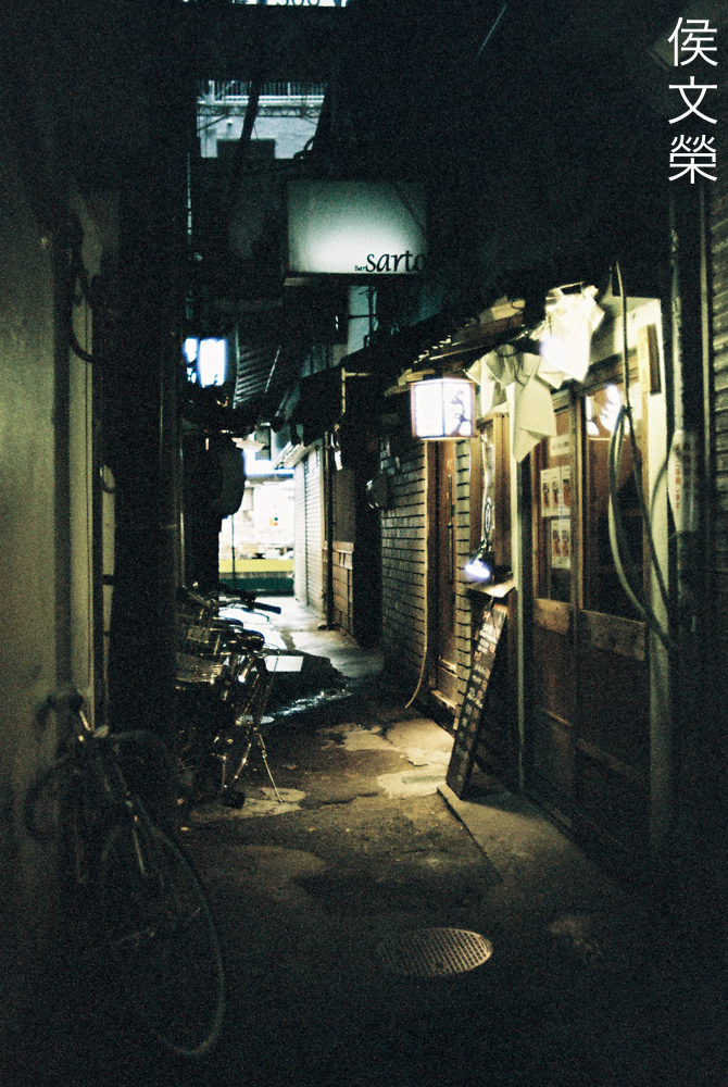
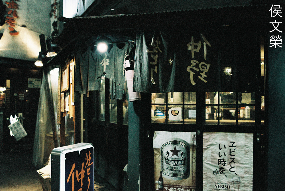
Shooting in the shade definitely helps a lot but it we now lose the unique characteristics of this film.
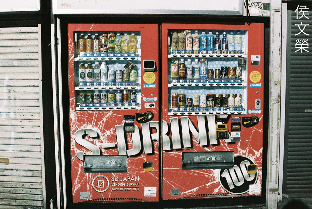
In this case the film behaves like a washed-out daylight stock, it does not look special and it doesn’t look either.
This looks like it was shot with a normal daylight film but what’s different is the yellows are all unsaturated. They look very bright in reality.
I took these with the film rated at ISO320 or so just to see if there’s any noticeable difference and I took these in the late afternoon or night just to see how it performs in lowlight conditions.
One thing you will notice is how the saturation improves somewhat as you shoot with it closer to ISO400. It still does not look as saturated as your usual daylight films, though.
The graininess of the film will be more obvious when you shoot this at faster speeds, it is beautiful and it adds something special to your photos, making this film great for shooting grungy cover photos of your favorite punk bands.
Of course, it’s easier to see the grain in your shadows. They look chunky, almost like the ones that you will get from most ISO400 monochrome film.
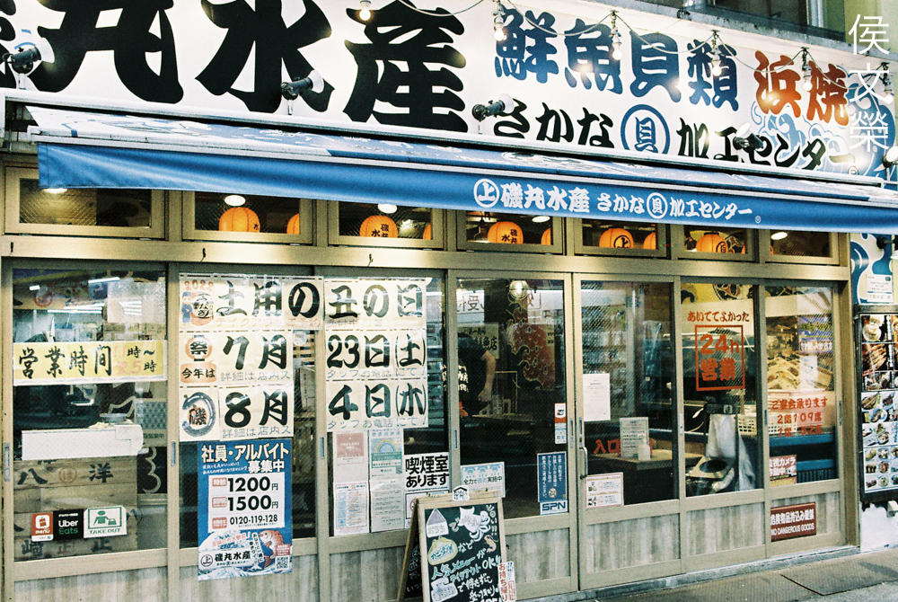
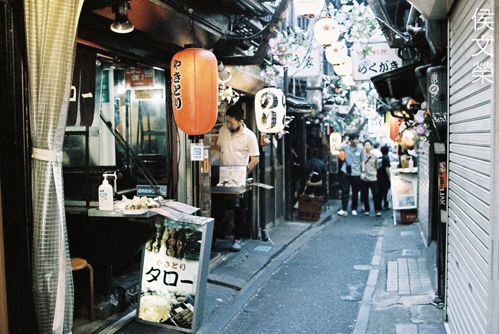
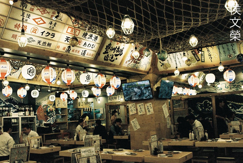
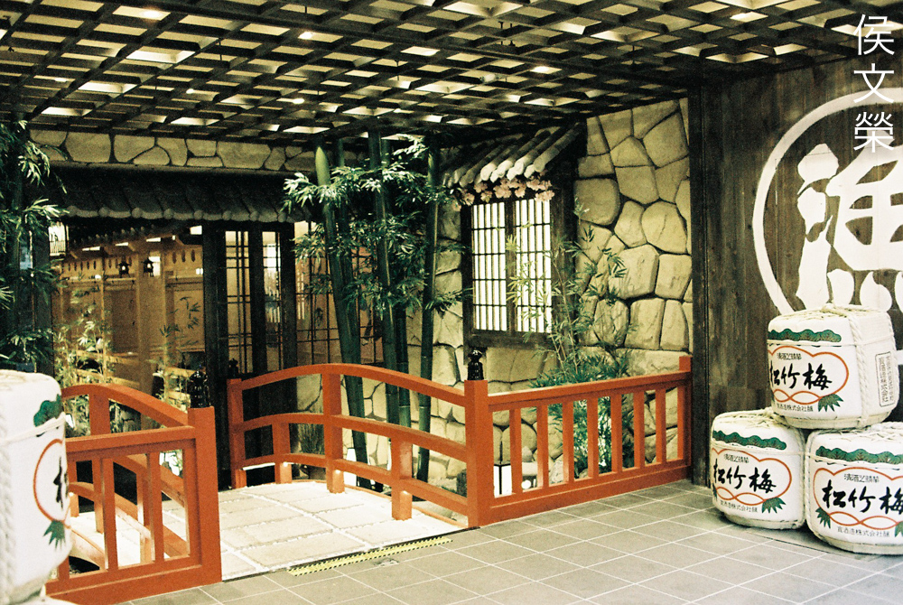
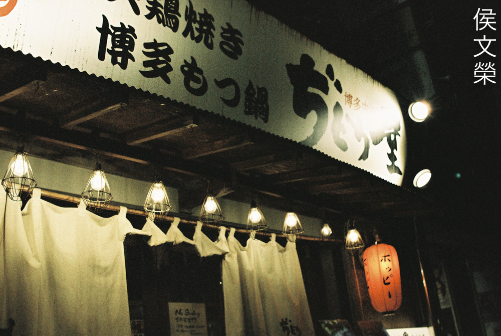
Notice how the normally brown exterior of this restaurant looks pale, almost like a shade of light-tan. The other colors remain a lot closer to how they look like in reality but the yellows are subdued. The whites doesn’t look off which hints that it does indeed alter the yellows more than anything else.
People who normally visit my site will be familiar with this restaurant and how amber it looks thanks to all the incandescent bulbs but. It’s now rendered in a more surreal look.
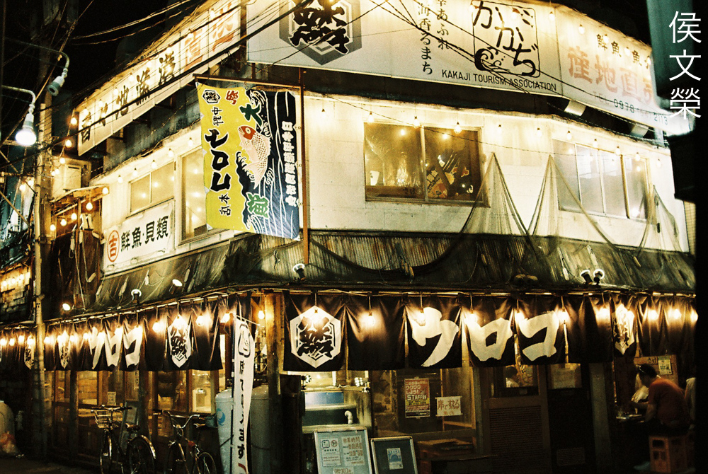
In photos where the yellows are not so dominant you’ll end up with a “normal-looking” photo, as if you’ve shot it with your usual daylight-rated film.
This film is rather forgiving when it comes to exposure, more than most films that I’ve shot. It yields lovely results even when you overexpose it by quite a bit.
Since this is not what I would call a fine-grained film, sharpness is not something that it excels at. You will be able to render nice details but not as much as what you’d get from a true ISO100 film, specially those with special grain structure.
Since resolving fine details will be quite a task for this film it’s best to shoot this with a smaller aperture. I bet that the 120 version of this film will look much better in terms of sharpness. When shooting with film, the larger the format the more details you’ll be able to capture. It’s the same with digital sensors but you will notice even bigger differences when shooting with film.
This shot would have looked a lot better if I overexposed it by 1/3 of a stop more. It can be tricky to meter this at times specially if you’re only relying on your camera’s meter. When shooting in lowlight situations it is best to use a spot-meter.
Your reds and greens will look subdued as well but not as much as your yellows. These colors have some yellow components to them and so they get affected by the color-shift. Attempting to correct this in post will yield an interesting result.
(Click to enlarge)
Here are more pictures that I took. Rather underwhelming for its cost, I’m not saying that it’s a bad film, it’s just not something that I would spend my money on unless I wanted to shoot a series with a theme such as a band’s album cover. You may find that it suits you better than me, it all boils down to the imagination of the art director.
Bonus:
I shot these with my Nikkor 50mm f/1.2 Ai-S. I wanted to give this another chance and use whatever I have learned from shooting with my first roll on this one. I didn’t know what to expect the first time and it is only fair to give this film another chance. There is only one minor difference this time, I shot these with the normal Lomography LomoChrome Metropolis 100-400 (old stock). This is an old film from some years ago, the shop probably has a problem selling these.
Compared to the high-end feel of the special edition the original stock’s packaging looks more “cheap”. The price is the same but I cannot find anything else that’s different apart from the packaging.
The unsaturated and dull colors mean that this is not the best one to use if you want to get that cyberpunk look. It’s best to stick to something like Cinestill 800T for this.
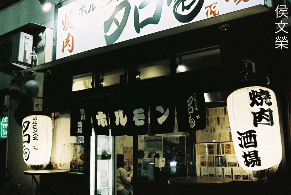
This roll has some weird things going on with it. You will notice a subtle horizontal line near the top edge of the frame.
You will also see a line in this photo that corresponds to the same place as the previous one. Could this be a defect of the film?
Here’s another example with the weird line. I do not like the grain structure as much in this photo, for some reasons it reminds me a lot of the cheaper films that I used to shoot with a long time ago like Sakura and Mitsubishi or even some cheap Chinese films.
Now we have this dark line in the frame, it’s definitely not coming from my equipment because I know my gear very well.
(Click to enlarge)
These photos show the same line or crack but at different places. I think the emulsion has been scratched, I don’t know if I can ask Lomography to compensate me for this.
The results will remind you of how old, weathered photos look. Some people apply filters to simulate this look but you can get the same results the authentic way which is just to shoot specialty film.
Certainly not the finest grain you will ever find out there but you don’t shoot this expecting to get high resolution photos.
(Click to enlarge)
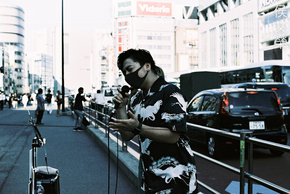
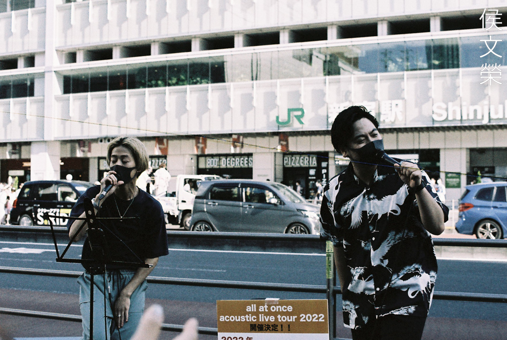
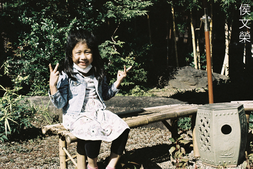
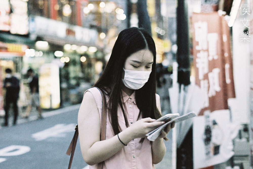
Learning from my lessons with the first roll I am now able to take better skin tones. It’s not as bad as before and my guess is right, it’s best to shoot people in the shade or just underexpose them a bit when shooting in direct sunlight. The last photo made the lady look “muddy”, I think she was underexposed too much, around 2-stops’ worth of light. The lady wearing pink looks great, she was exposed perfectly and this is probably what you should be aiming for when shooting this film.
I personally do not like oversaturated film but this one is too dull for my taste.
These are usually brighter when shot with your usual daylight film. It’s all gloomy and sad in this picture.
I’d imagine that this would make a great setting for a photoshoot, all I need is beautiful person standing in the middle. Shooting in the shade or just somewhere not directly exposed to direct sunlight is the way to get better skin tones with this film as far as I can recall from my experience with it.
(Click to enlarge)
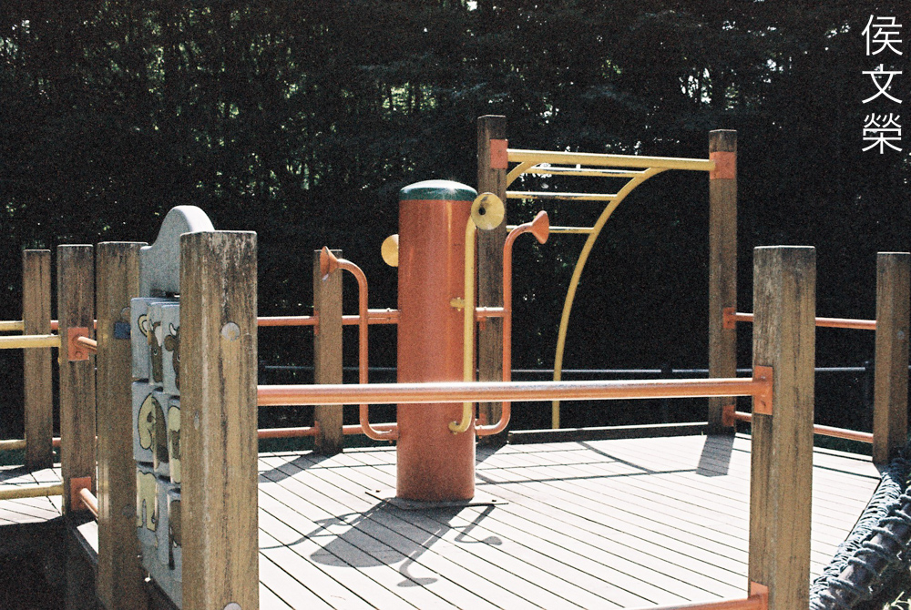
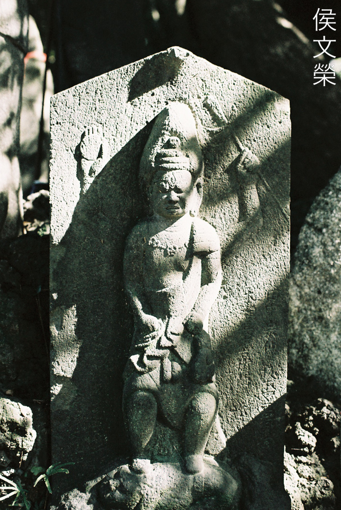
These should show you how it handles grey tones, certainly not the best use for this film. It’s probably better to shoot people with brightly colored clothes with this.
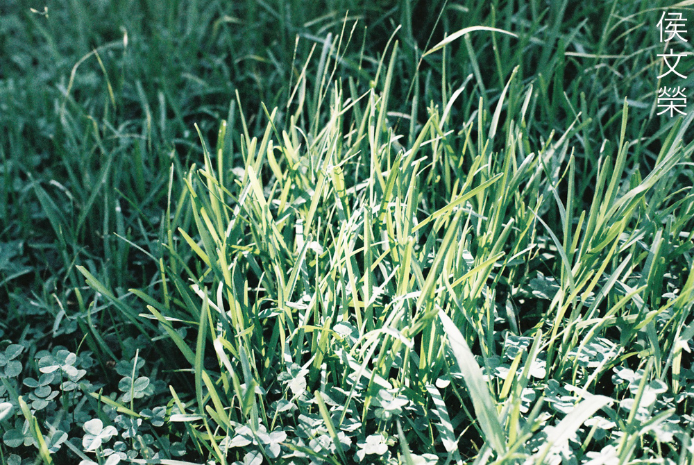
This film is not good at rendering greens at all but you can put it to good use if you want to make someone dressed in bright red standout from thee background.
(Click to enlarge)
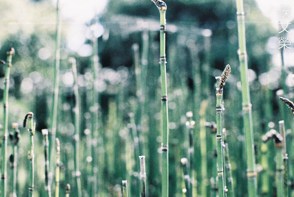
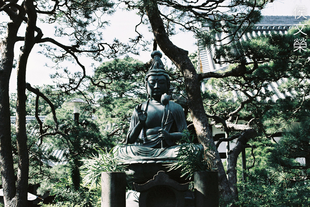
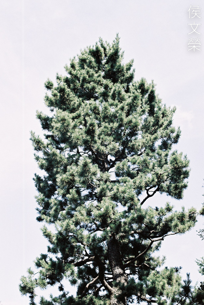
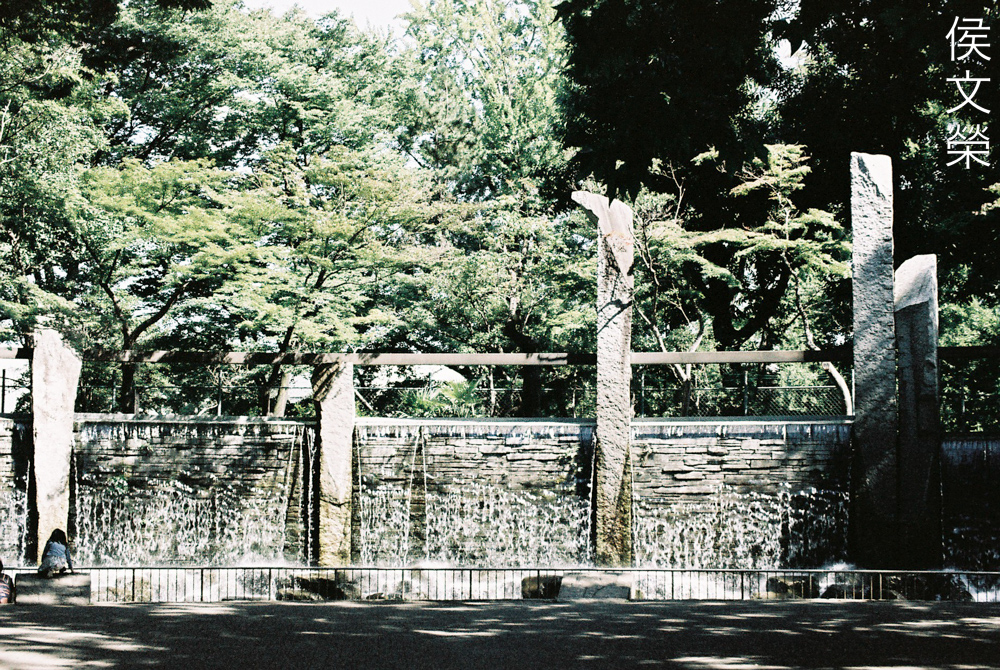
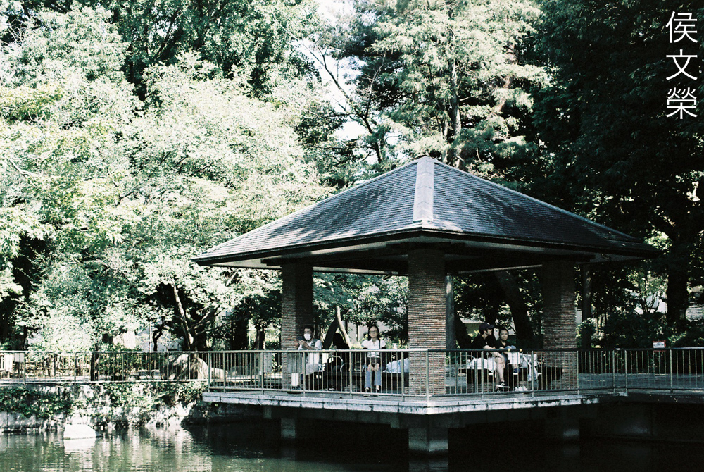
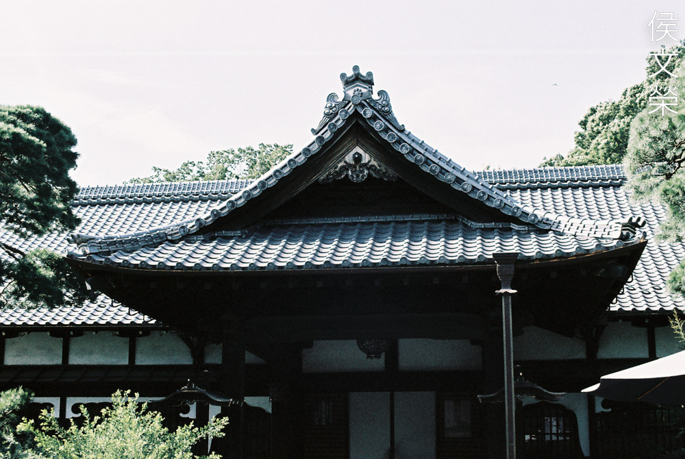
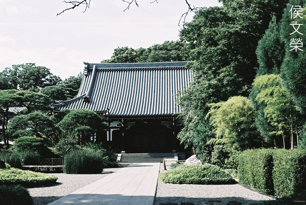
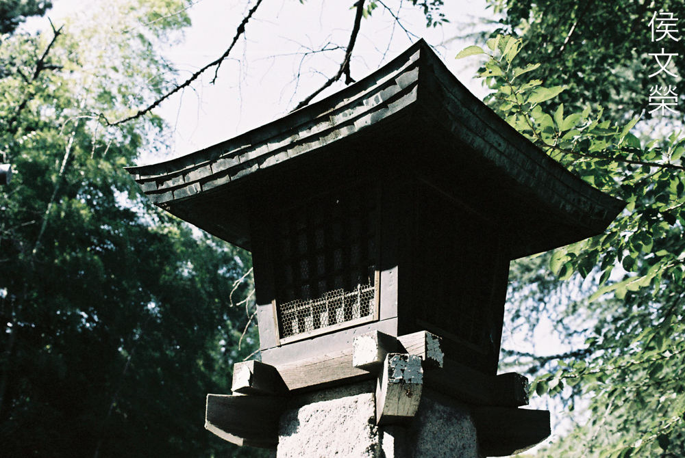
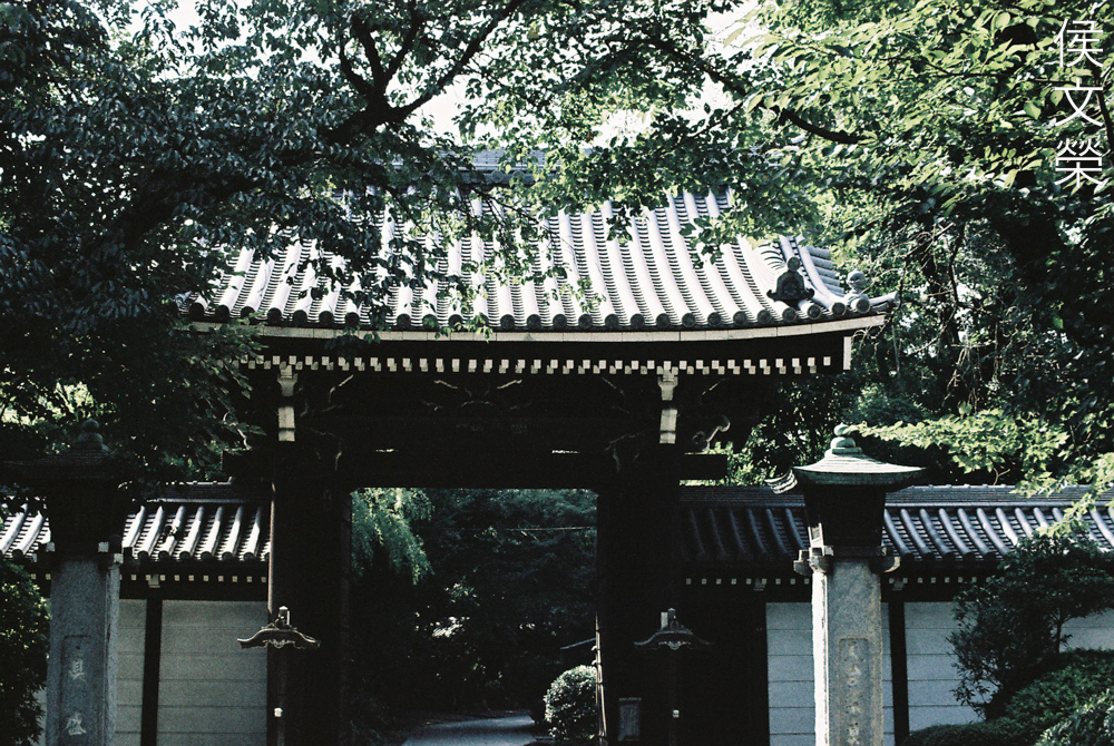
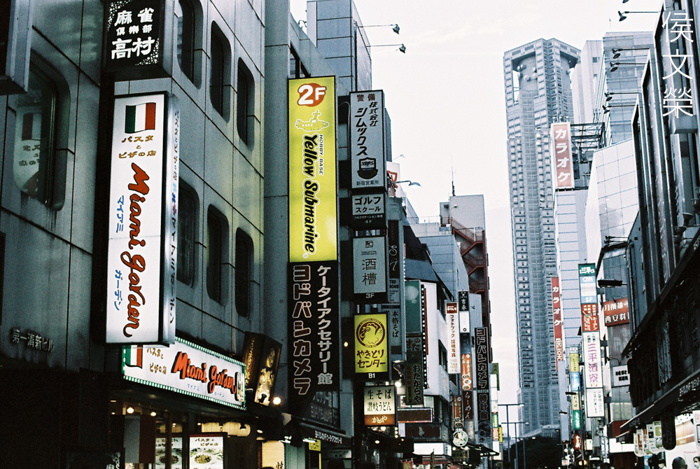
I don’t think this film is good for nature or outdoor photography. It’s definitely better suited for urban shots, that’s probably why the film is called “Metropolis” for a reason.
(Click to enlarge)
What’s a little bit of a turnoff for me is how it renders blue or azure, notice how the sky looks ugly in these photos, I was hoping it would selectively just affect the yellows but leave the reds and blues intact but that’s not the case. It’s difficult to find a use for this look specially if you are used to something that looks brighter. Maybe I should just stick to daylight film instead of this one and save my money.
While I did not really enjoy shooting with this I am sure that more talented photographers will find it more useful for their creative vision. However, I am not closing the doors on this film yet, I may shoot with it one more time in the future if I’ve found the right inspiration and situation. This is not a cheap film for experimenting, you will have to at least expose a single roll to get a feel for it. I am not saying that you won’t get nice results in your first roll, all I am saying is that you won’t get consistent with it until you’ve shot at least 2 or 3 rolls of it. That may be fine for some but it’s prohibitive for most of us because a roll can cost $17.00 at least, if you are lucky enough to find one for sale from a legit seller. There’s a lot of potential for this film, all you need is the right vision.
I hope you enjoy this post, it’s my first in a very long time. If you like my work please consider supporting my blog, everything is used on purchasing, processing and scanning film. Every bit of help is deeply appreciated and will ensure that this site continues to educate and entertain photographers, new and old alike. Happy shooting!
Help Support this Blog:
Maintaining this requires resources and a lot of time. If you think that it has helped you or you want to show your support by helping with the site’s upkeep, you can make a small donation to my paypal.com at richardHaw888@gmail.com. Money isn’t my prime motivation for this blog and I believe that I have enough to run this but you can help me make this site (and the companion facebook page) grow.
Buy me a roll of film or a burger?
Thank you very much for your continued support!
$2.00
Helping support this site will ensure that this will be kept going as long as I have the time and energy for this. I would appreciate it if you just leave out your name or details like your country’s name or other information so that the donations will totally be anonymous. This is a labor of love and I intend to keep it that way for as long as I can. Ric.

2 Comments (+add yours?)